Client
Shasha
Service
User Interface
Industry
Media
Date
Jan 2025
Shasha isn't just a streaming platform
it's where Arab storytelling finds its screen.
Benchmarking
Understanding the Arabic cultural media landscape
Before drawing a single screen, we examined the world’s leading OTT platforms analysing features, UX patterns, visual systems, and cross-device compatibility. The goal: map what fails, extract what works, and find the exact gaps where Shasha could lead.
RTL is a foundation, not a feature
Every competitor treats Arabic as a localisation layer added on top of an English product. The layouts, spacing logic, and reading flow are all designed LTR-first Arabic is an afterthought. Shasha had the opportunity to reverse this entirely.
TV UX is a discipline of its own
No competitor invests meaningfully in the 10-foot experience. Mobile patterns are copy-pasted onto TV screens focus states are invisible, type is unreadable from a distance, and D-pad navigation is broken. The TV experience was universally the weakest touchpoint.
Discovery is broken everywhere
Across all platforms studied, content rails lack hierarchy, paid vs. free states are poorly communicated, and geo-blocking offers no feedback. Users are abandoned mid-journey with no clear path forward. This became one of Shasha's clearest design opportunities.
Discovery highlights
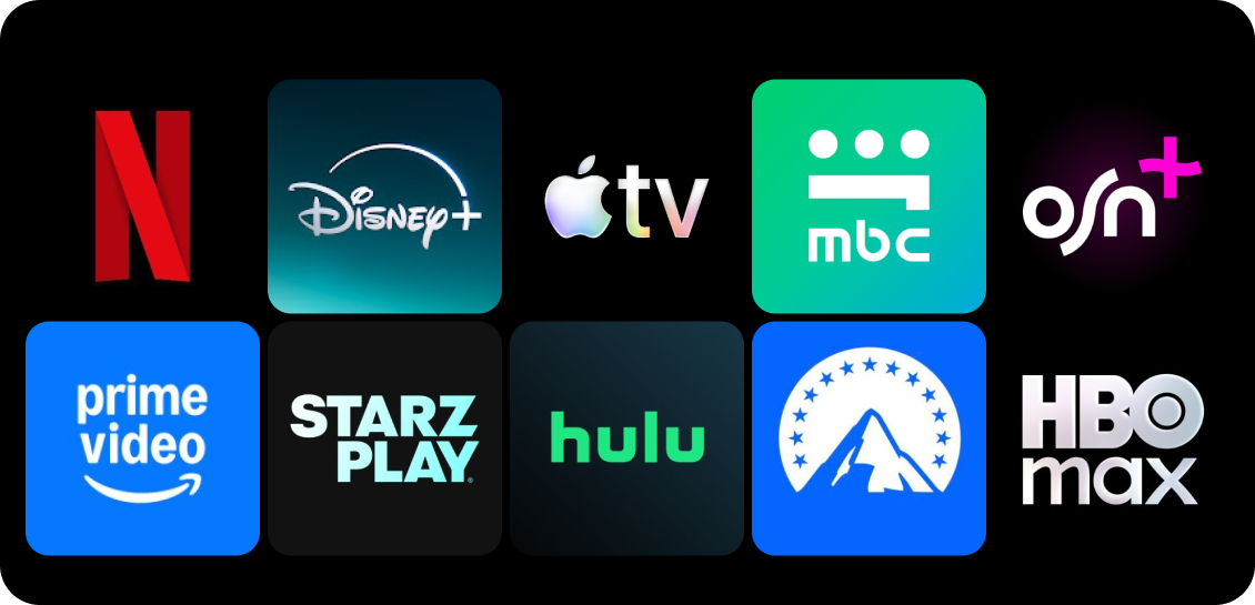
Platforms Studied
A close look at the streaming giants
We audited each platform across mobile, TV, and web noting UX patterns, information architecture, RTL handling, and visual language quality.
From signals to themes
Netflix
Content rows & hero layout
Disney+
Premium brand language
Apple TV+
Editorial minimal UI
Prime Video
Dense catalogue + live
StarzPlay
Regional Arabic UX
Mobile App
Designing for thumb-first, scroll-native discovery
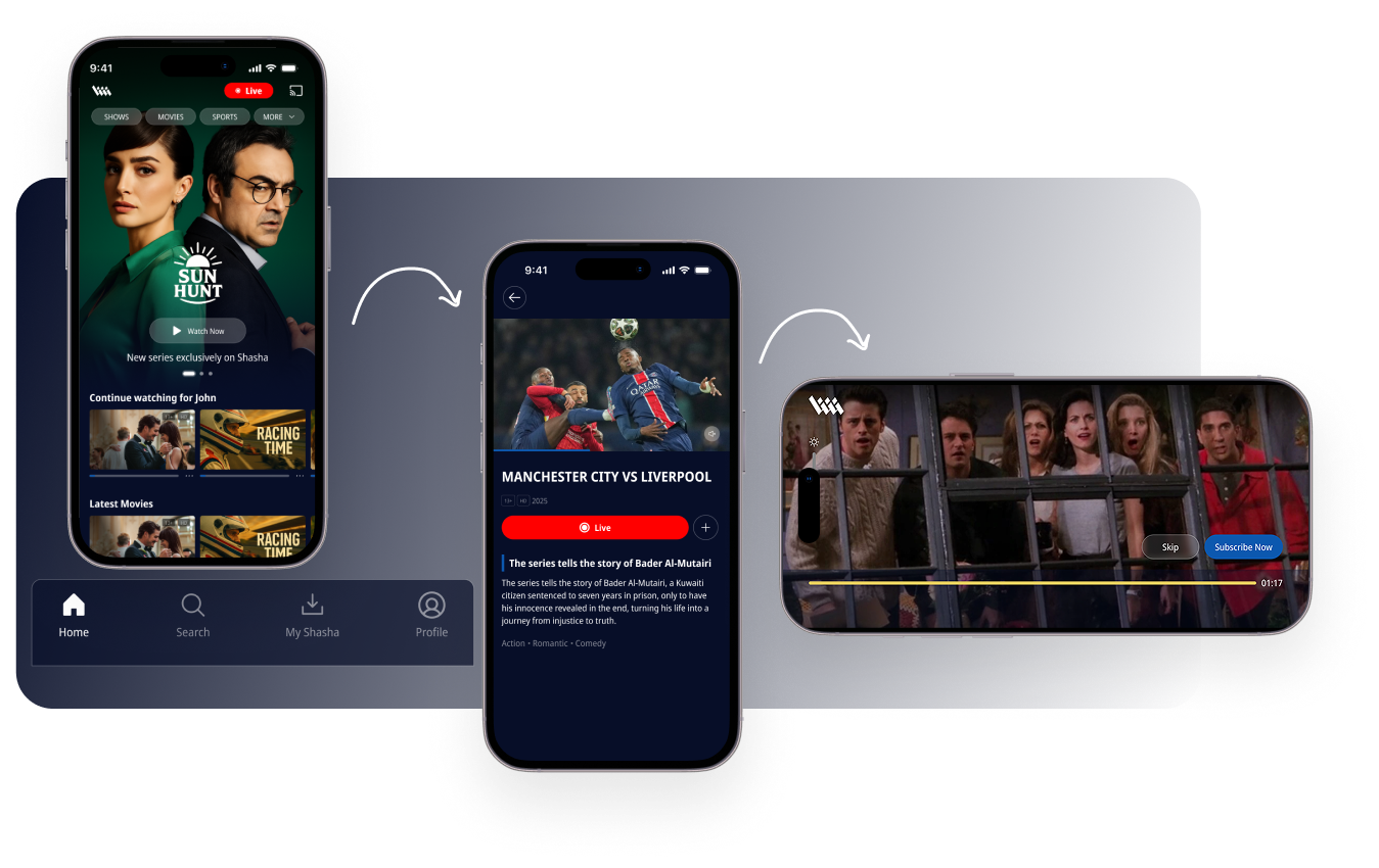
The mobile app was built around content-first bottom navigation, cinematic hero cards, and a live broadcast rail. Arabic RTL was designed first then English LTR adapted from it, not the reverse.
Content-first navigation
Bottom tab navigation keeps core actions always reachable with one thumb. The UI disappears behind the content dark background ensures thumbnails and artwork are always the focal point.
Live & real-time states
The live badge (مباشر) is a persistent urgency signal surfaced at the top of every session. Paid vs. free content is clearly badged at the card level no surprises, no interruption to the browsing flow.
Player as a first-class experience
Skip intro, skip credits, and fast-forward are one-tap controls not buried in menus. Chromecast and AirPlay handoff states are integrated directly into the player UI, not added as afterthoughts.
Smart TV
The TV 10-foot experience
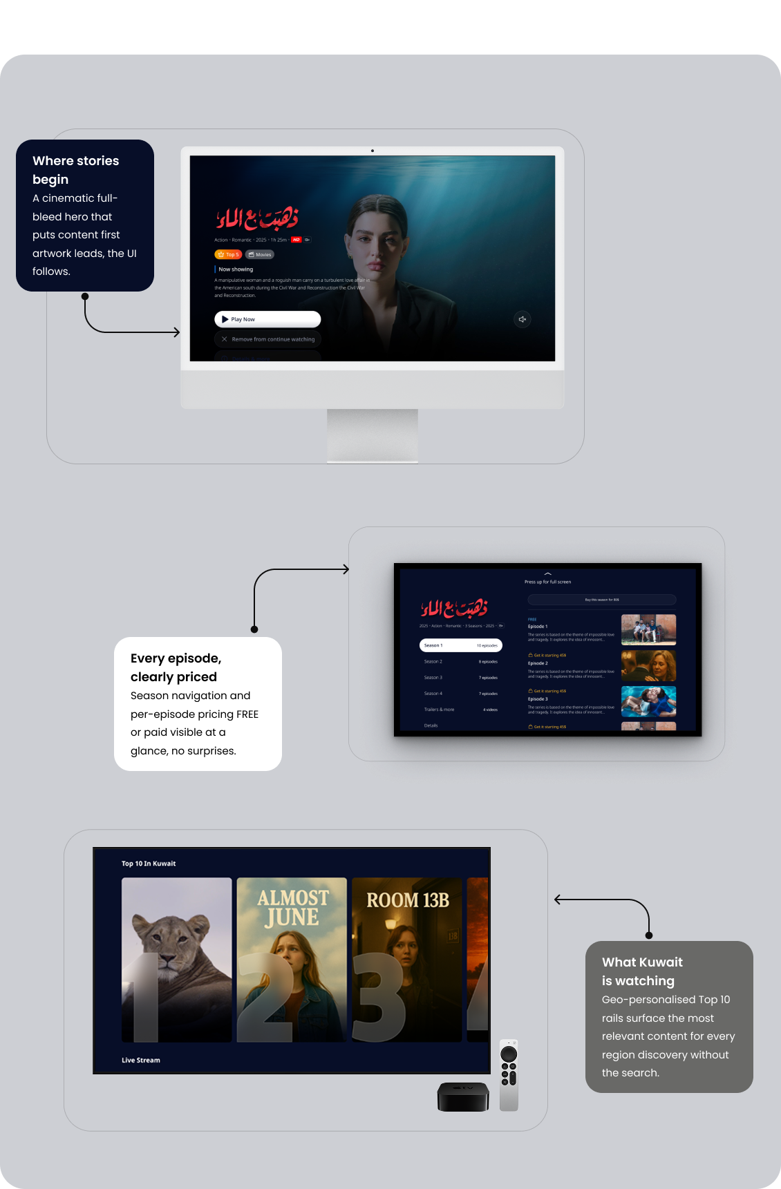
TV UX operates by completely different rules. Text must be legible from 3 metres. Navigation must work with a D-pad. Focus states become the primary interaction signal. We designed across Samsung TV, LG TV, Apple TV, and Android TV all from a single visual system.
Cinematic hero, minimal chrome
The hero is full-bleed artwork with minimal UI overlay the show does the selling. Season and episode sidebar gives persistent context so users always know exactly where they are in the content hierarchy.
D-pad first interaction model
Every interaction was designed for a remote control, not a touchscreen. Focus rings are visible on both dark and light content backgrounds. FREE vs. paid badges appear per episode no subscription surprises mid-binge.
Four platforms, one visual system
Samsung TV, LG TV, Apple TV, and Android TV each have different technical constraints and store guidelines but all share the same Shasha visual identity, spacing system, and component logic. PiP state is supported across all variants.
Design System
A visual identity rooted in Arabic culture
From benchmarking emerged a clear direction: bold, editorial, and culturally grounded. Al Thaqafiya’s design system uses a striking pink-magenta accent to cut through the visual noise of the Arabic media landscape — distinctive, memorable, and RTL-native from the ground up.
Editorial homepage
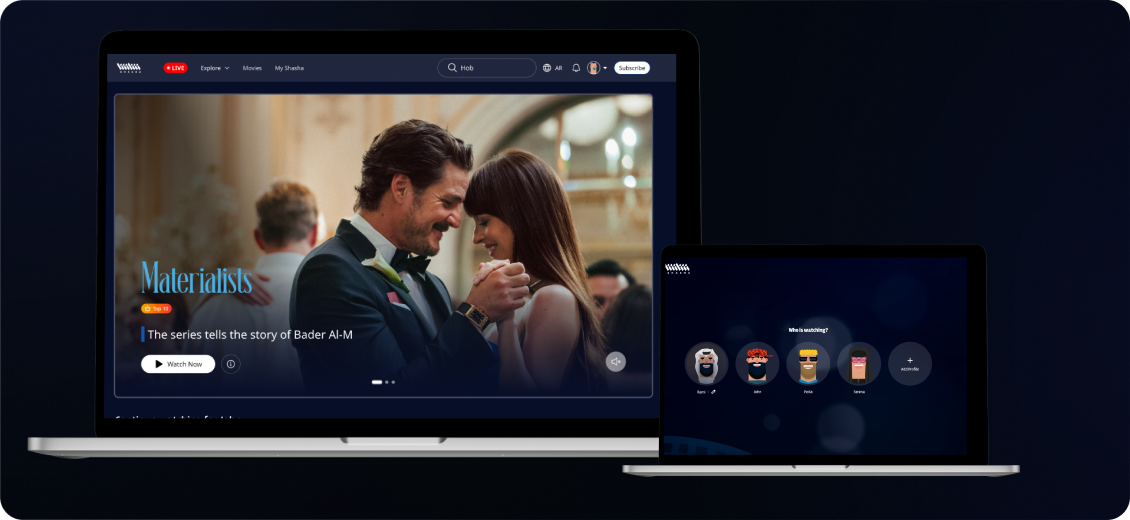
Full-bleed cinematic hero makes content the first and only impression on load. Hover-state card previews let users discover more without leaving the browsing context reducing navigation friction and increasing content surface area.
Transparent geo & access states
Geo-blocking is communicated with clear, helpful empty states users always understand why content isn't available and what their options are. Subtitle, language, and quality controls are reachable within two interactions in the player.
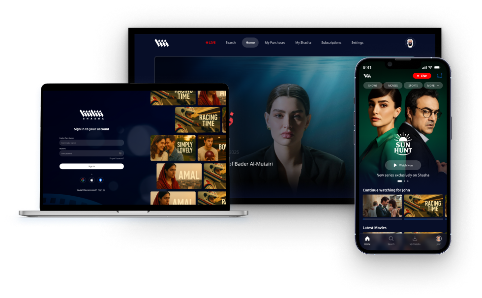
One Shasha, everywhere
Watchlist, profiles, and viewing history are synced across Mobile, TV, and Web in real time. Whether a user starts watching on their phone and continues on TV, the experience picks up exactly where they left off.
The approach
Three platforms. One cohesive product
Each surface required its own design logic, but one identity tied them together. Here’s how we thought before we drew anything.