
Client
Al Araby Plus
Service
User Interface
Industry
Media
Date
Jan 2025
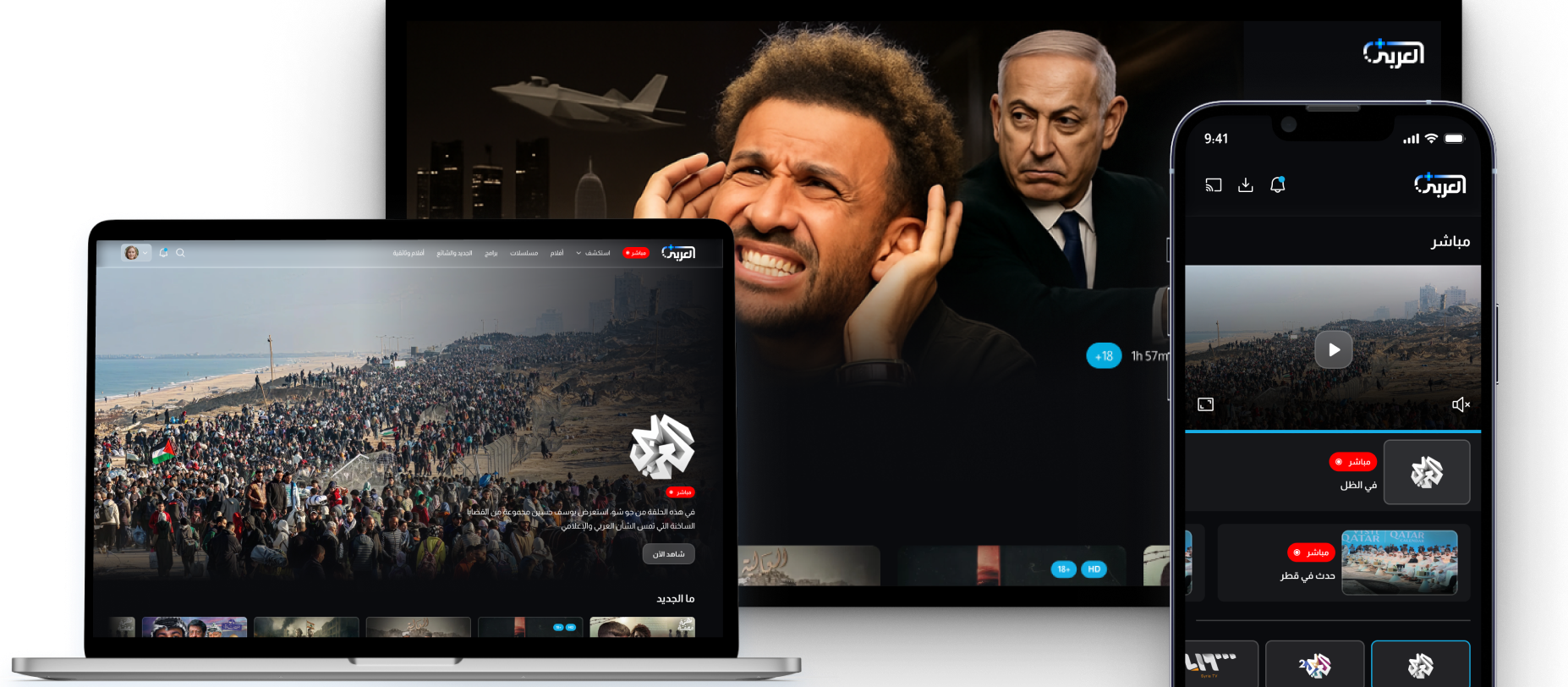
Al Araby+ isn't just a streaming platform,
it's Arab news reimagined.
Benchmarking
Mapping the Arabic streaming and news landscape
Before designing a single screen, we studied how the world’s leading Arabic news networks and global streaming platforms handle content discovery, live broadcast integration, multi-profile management, and cross-device continuity. This benchmarking phase grounded every design decision in established patterns that Arabic audiences already trust.
With three platforms to deliver, mobile, web, and TV, the challenge was not just designing screens but building a consistent system that scales coherently across all three without losing the brand identity.
Live is the anchor feature
For Arabic news platforms, live broadcast is not a feature , it is the primary reason users open the app. "مباشر" needs to be one tap from any state in the product.
Multi-profile is a family expectation
Arabic-speaking households are multi-generational. The "من يُشاهد؟" (Who's watching?) profile picker, pioneered by Netflix, is now an expected baseline, not a differentiator.
TV requires a completely different model
Side nav (not bottom tab) dominates Smart TV streaming UI. Icon-first with label-on-hover reduces visual clutter on the 10-foot display while keeping navigation visible.
Discovery highlights
Platforms Studied
A closer look at Arabic media and global streaming
We went deep into eight platforms across Arabic news, regional OTT, and global streaming, studying their content hierarchy, live broadcast treatment, profile systems, navigation patterns across mobile, web, and TV, and how they balance news credibility with entertainment appeal.
Al Araby+ sits at the intersection of two worlds: the authority of a news channel and the product expectations of a modern streaming service. The benchmarking phase defined exactly where the line between both had to be drawn.
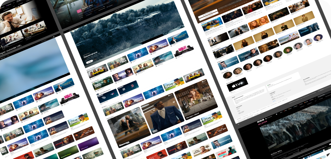
Al Jazeera
Arabic news baseline
Shahid
Arabic OTT leader
OSN+
Premium streaming UX
Netflix
Profile & discovery patterns
Prime Video
Live + VOD hybrid
Discovery activities
Design System
A visual identity built for trust and tension
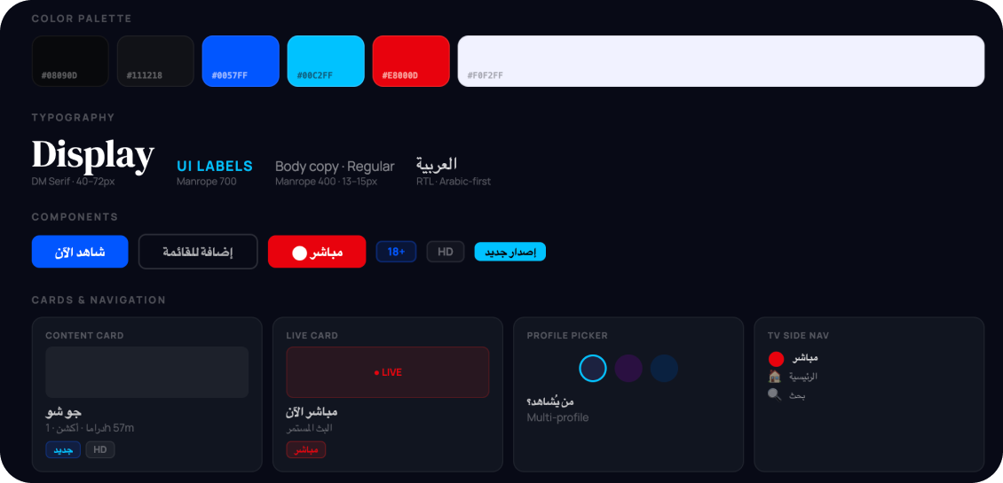
Al Araby+ needed to feel simultaneously like a premium entertainment platform and a credible news source. Deep navy anchors the brand in authority. Electric blue and cyan punctuate interaction. Red signals live. Together they build a system that is dark, confident, and unmistakably Arab.
Dark navy as premium authority
Deep #08090D, darker than competitors, signals cinema-grade content. Not generic streaming dark, but specifically calibrated for a platform where news and drama coexist.
Cyan for interaction, red for live
Two accent colors with distinct jobs: electric cyan drives every CTA and interactive state; red is reserved exclusively for live content. No crossover, no confusion.
RTL-native across all three platforms
Navigation, content carousels, article reading, and TV side nav — every surface was designed right-to-left from the first frame. Arabic is not a translation layer.
Mobile App
Live news and rich content in one thumb reach
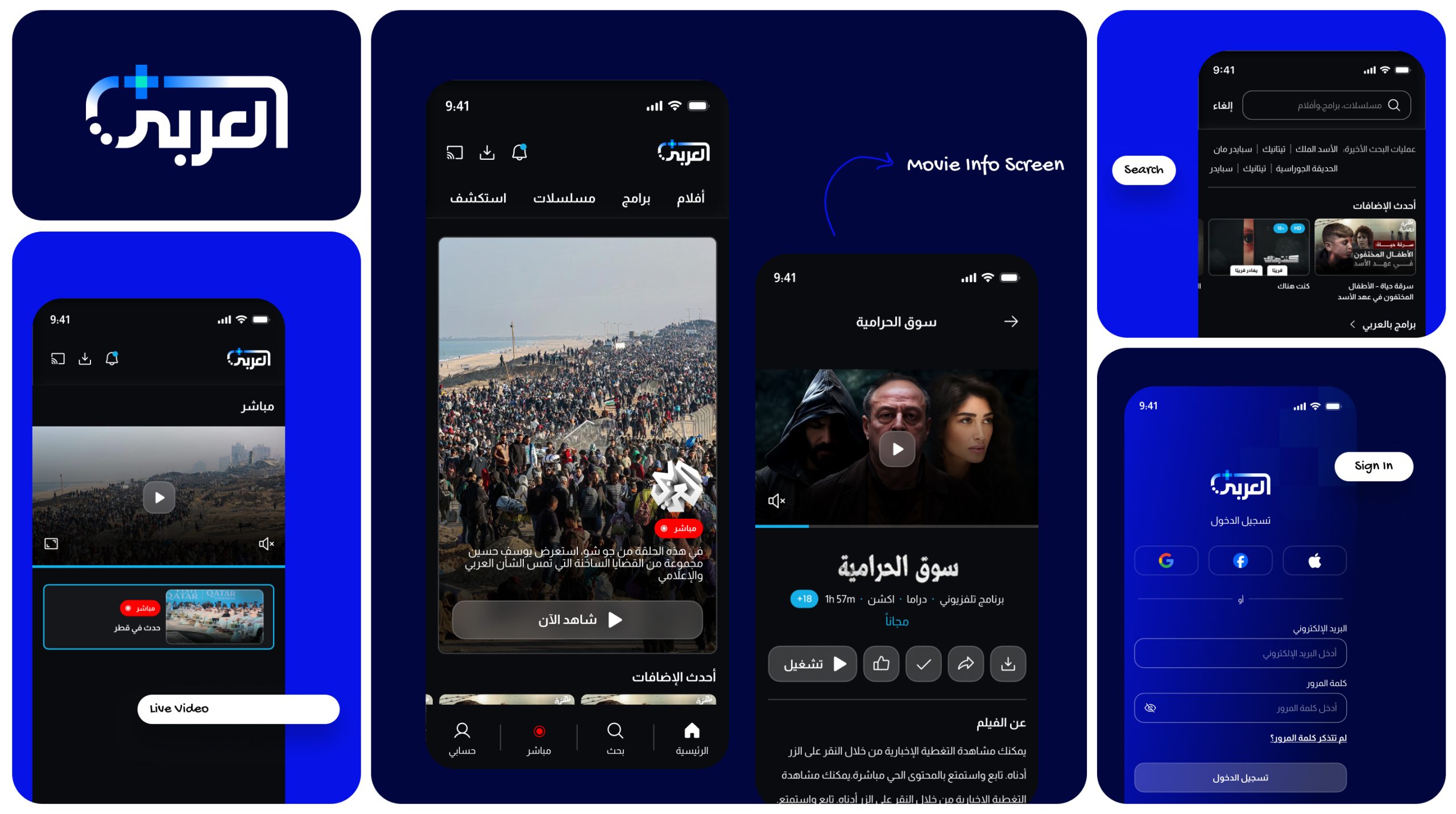
The mobile app serves two types of users: the news-first viewer who opens the app for the live broadcast, and the entertainment viewer who browses the series and film catalogue. The IA and navigation had to serve both without friction.
The side-swipe menu, live tab in the header, multi-profile picker on launch, and content-first homepage work together to get any user to their intended content in the fewest possible taps, regardless of their intent.
Multi-profile picker
3D avatar-style profiles with a clean "+" to add new profiles. Launched on app open — zero-friction household sharing that respects each user's viewing history and preferences.
Live Page:Video & Audio modes
The Live page offers both video and audio streaming with a clear toggle — for users who want Al Araby TV playing in the background while doing something else. EPG schedule beneath the player.
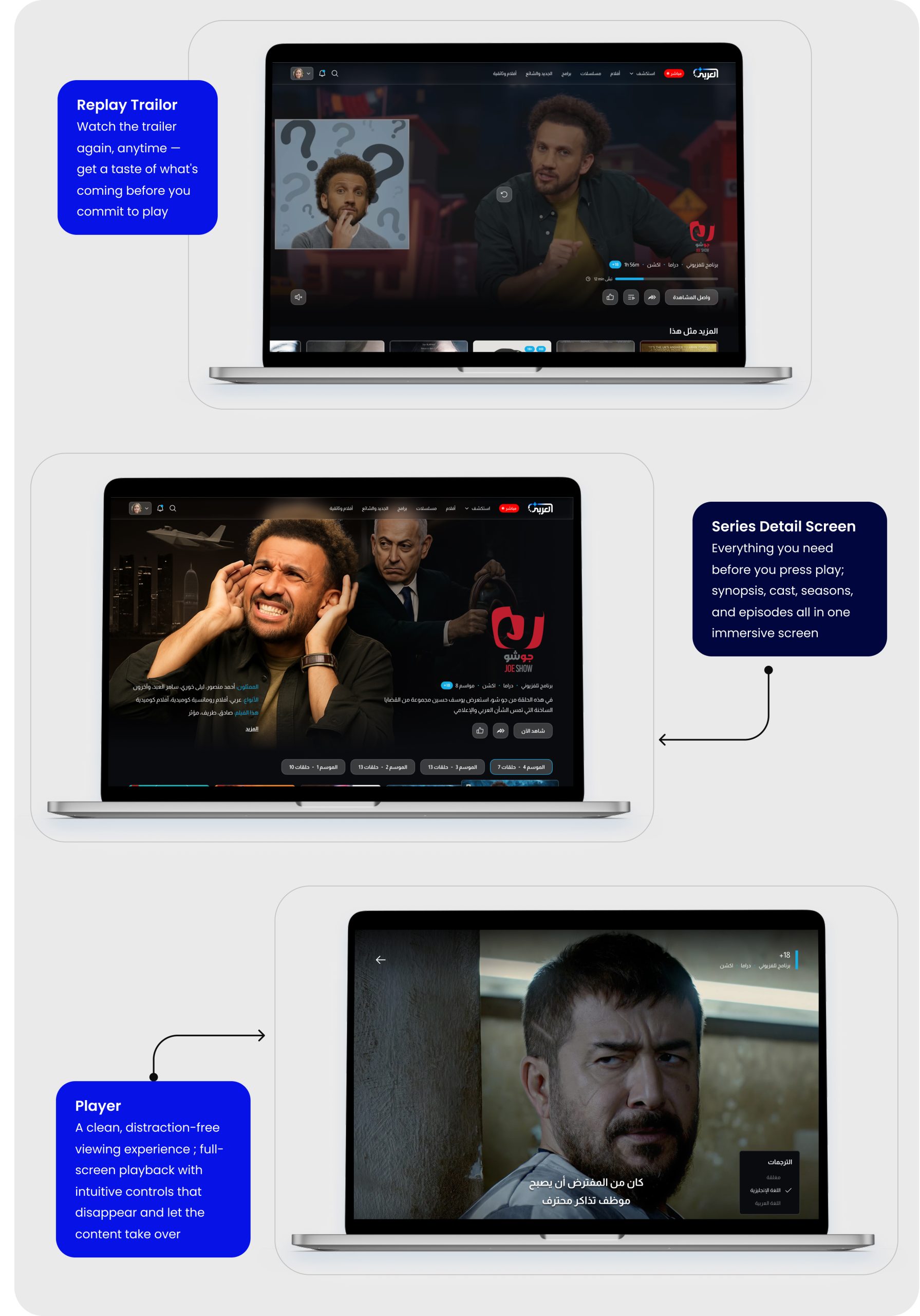
Series detail
Content detail with show logo, genre tags, season/episode browser, cast info, and "Continue Watching" state. Two CTA tracks — subscribe or watch free — handled cleanly without feeling paywall-heavy.
Smart TV
The 10-foot experience — news meets cinema
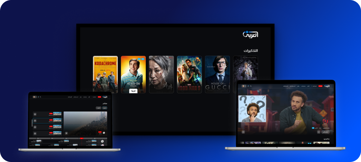
The Smart TV interface presented the most distinct design challenge. A persistent side navbar — icon-first, with labels revealed on hover — keeps navigation always accessible without taking space from the content hero. Every screen is built for D-pad navigation with high-contrast focus states.
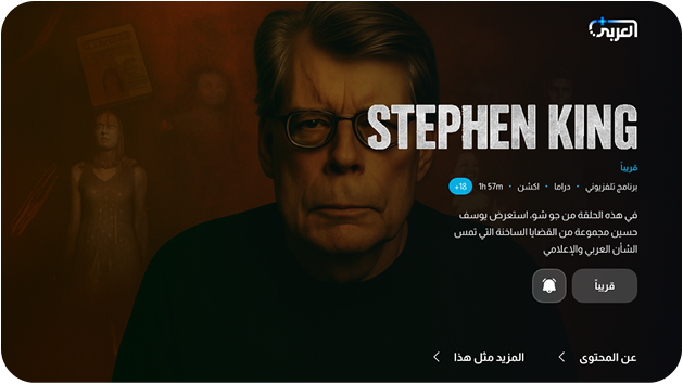
The live broadcast section is given front-row treatment on TV — because for a news platform’s TV audience, live is not a secondary feature. Coming Soon screens handle unsubscribed and pre-launch states with clear CTAs and reminder bells, reducing churn before content launches.
Focus States
A consistent electric cyan border appears on every focused element — matching the brand's primary interactive color and providing unambiguous D-pad feedback.
Navigation
Collapsed icons with labels on hover. The pattern maximises content area while keeping all navigation options within one directional move at all times.
Live Priority
Live is pinned to the top of the side nav with a persistent red dot indicator — visible in collapsed state, always one click away from any screen in the product.
Delivery
Three platforms. One Arabic streaming identity.
Al Araby+ launched as a fully designed, multi-platform product. A single design system — one set of tokens, one component library, one RTL-native logic — powering a mobile app, a responsive website, and a Smart TV interface. Every screen, every state, every interaction carries the same visual DNA.
- 3 Platforms designed (Mobile · Website · TV)
- 100+ Total screens designed
- 01Unified RTL design system
- 50+ Reusable components
The approach
How we built a tri-platform media product from benchmarking alone
Al Araby+ is a product that lives at the intersection of two demanding categories — live news and premium streaming. Neither category tolerates friction. Rather than starting with user interviews, we used competitive intelligence to decode what works across both worlds, then built a system that could hold both without contradiction.
01
Decoded the competitive landscape
We studied Al Jazeera, Shahid, OSN+, Netflix, and Prime Video — mapping every navigation pattern, content card, live feature, profile system, and TV interaction model before writing a single design decision.
02
Built one system for three screens
A single RTL-native design system scaled from 375px mobile to 1440px website to 960px Smart TV. Same tokens, same components, same logic — adapted to each screen paradigm without forking the system.
03
Delivered a distinctive
identity
Deep navy, electric cyan, and reserved red. Three colors with three distinct jobs — brand, interaction, and live. A system that is instantly recognisable and impossible to confuse with any competitor.
What we learned
Live always leads the hierarchy
The live button and the browse catalogue cannot share equal visual weight — one must lead. For Al Araby+, live leads on every platform, every surface, every state. That single hierarchy decision defines the entire product.
TV is not a large phone
Side nav, D-pad navigation, icon-first layout, 10-foot typography — none of this can be approximated by porting mobile screens. Every TV screen was designed from scratch with remote-only interaction as the sole constraint.
Multi-profile builds family trust
In Arabic households, a shared account means shared history and shared recommendations. The "من يُشاهد؟" screen is not a convention we copied — it is a direct response to how Arabic families actually watch together."
