
Client
Pediatric clinic
Service
User Interface
Industry
Health
Date
Jan 2026
Kids Airline isn't just a dashboard,
it's a child's safe journey.
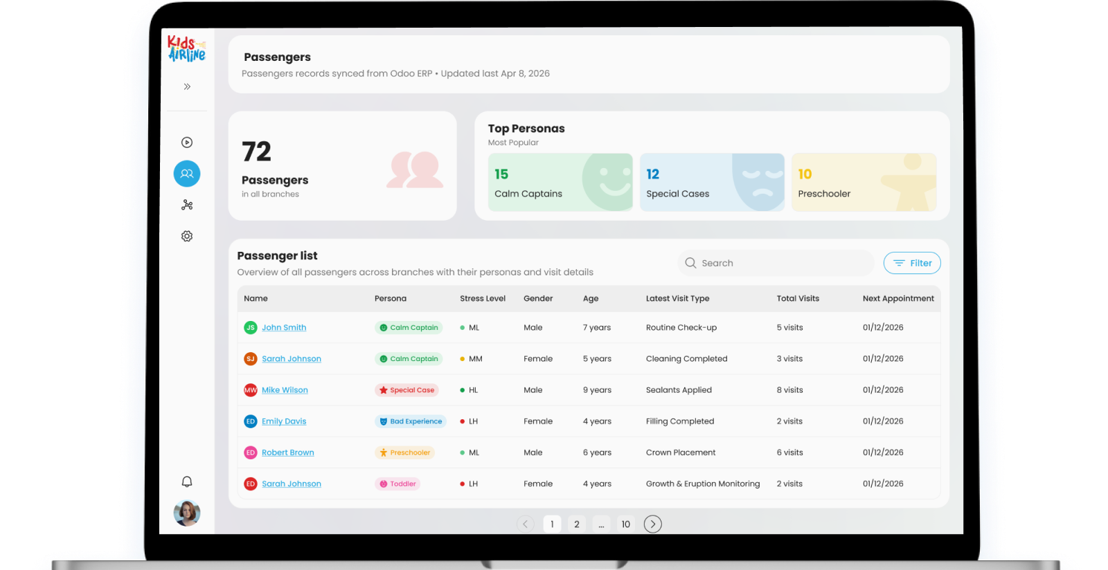
Benchmarking
Understanding pediatric anxiety and clinical dashboards
Before designing a single screen, we studied two parallel fields: pediatric anxiety management in clinical settings, and existing clinical dashboard products. The challenge was rare — most dental software is designed purely for administrative efficiency, completely ignoring the emotional experience of the child in the chair.
This benchmarking phase defined the core design opportunity: no product on the market was treating the child as a user alongside the clinician. Kids Airline would be the first to build both into a single system.
Dental anxiety is a clinical problem
Up to 20% of children experience significant dental anxiety. No existing software tracked stress physiologically during a session or gave clinicians real-time data to adapt their approach
Clinical dashboards ignore the child
Existing dental software is built for billing and scheduling, not for the moment-by-moment reality of treating an anxious child in the chair. The data exists; the UX doesn't.
Metaphor is a clinical intervention
Research in child psychology shows that reframing a frightening experience through a familiar narrative measurably reduces anxiety. The flight metaphor is not decoration, it is the product.
Discovery highlights
Reference Field
Where clinical software meets child psychology
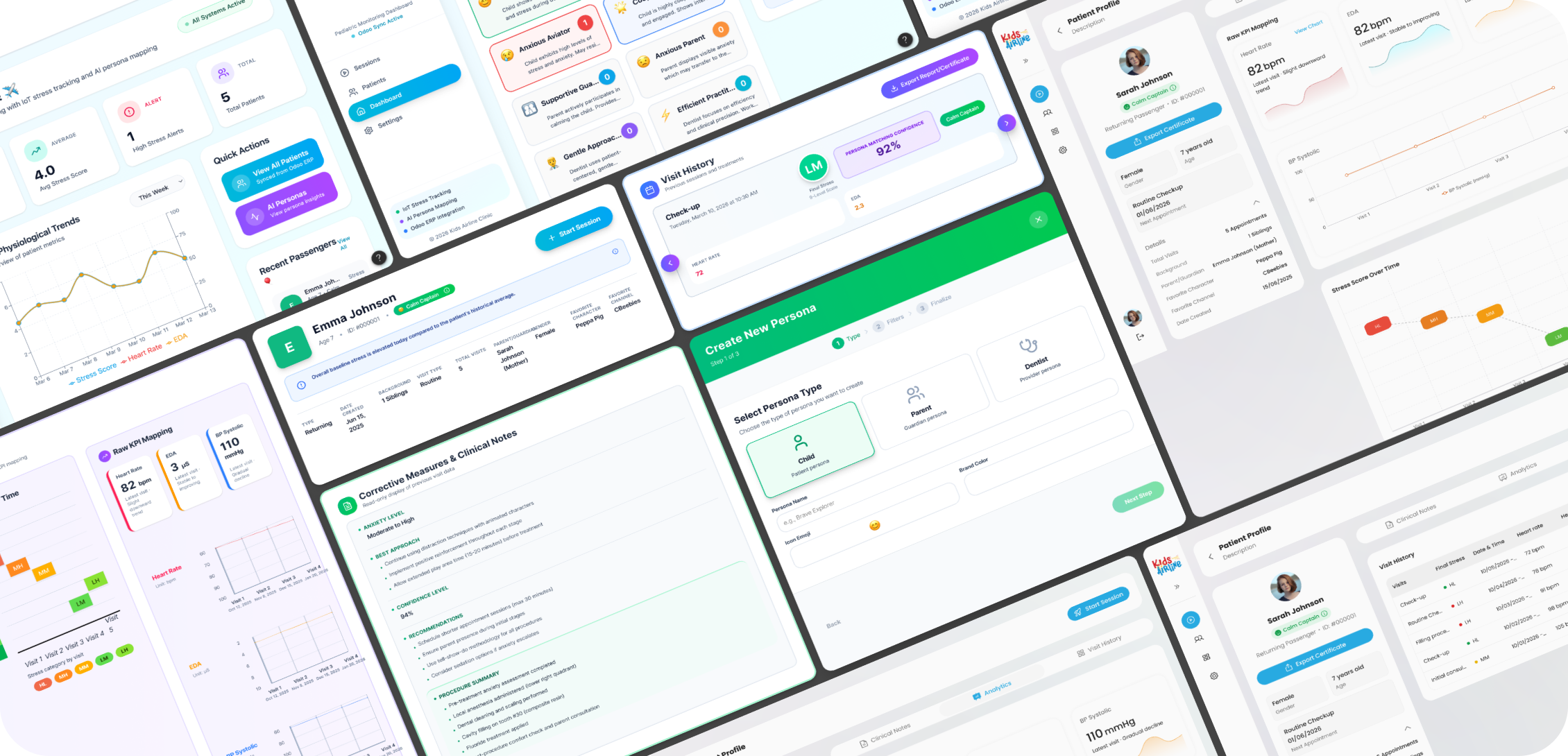
We studied four categories of reference products: clinical practice management software, biometric monitoring dashboards, gamified healthcare tools for children, and airline/journey metaphor products. No single product combined all four — which defined the white space Kids Airline was designed to own.
The insight was that the best UX reference was not a medical product at all — it was how airline apps communicate a multi-stage journey with status, alerts, and real-time updates in a way that feels reassuring rather than clinical.
Dentrix
Clinical management baseline
Biometric Dashboards
Live data display patterns
Child Health Apps
Gamification for kids
Airline UX
Journey metaphor & status
Discovery activities
Design System
Designed to feel safe, not sterile
Kids Airline needed to feel simultaneously professional enough for a clinical environment and warm enough for an anxious seven-year-old to not feel afraid. The design system walks that line deliberately — clean whites, playful logo, red for alerts, blue for action, yellow for encouragement.
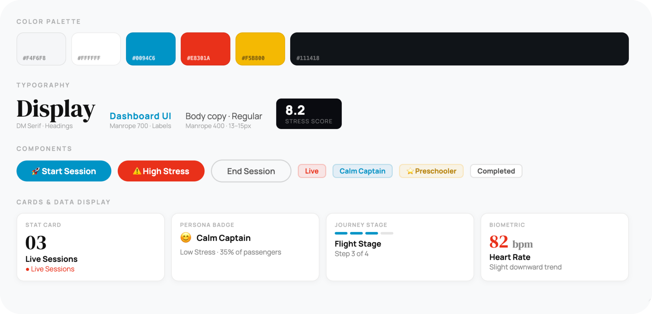
Flight metaphor is a clinical tool
Check-in, Boarding, Flight, Exit, these aren't branding choices. They're a structured anxiety-reduction framework that gives children a familiar, non-threatening narrative to hold onto.
Red means act now
Red is reserved exclusively for stress alerts and live states. Yellow for moderate warnings. Blue for all primary actions. The color system is a clinical communication layer, not decoration.
Data that changes decisions
Every metric on screen, heart rate, EDA, stress score, is there because a clinician can act on it in real time. No vanity data. Every number has a clinical implication behind it.
Core Screens
A dashboard that thinks like a clinician
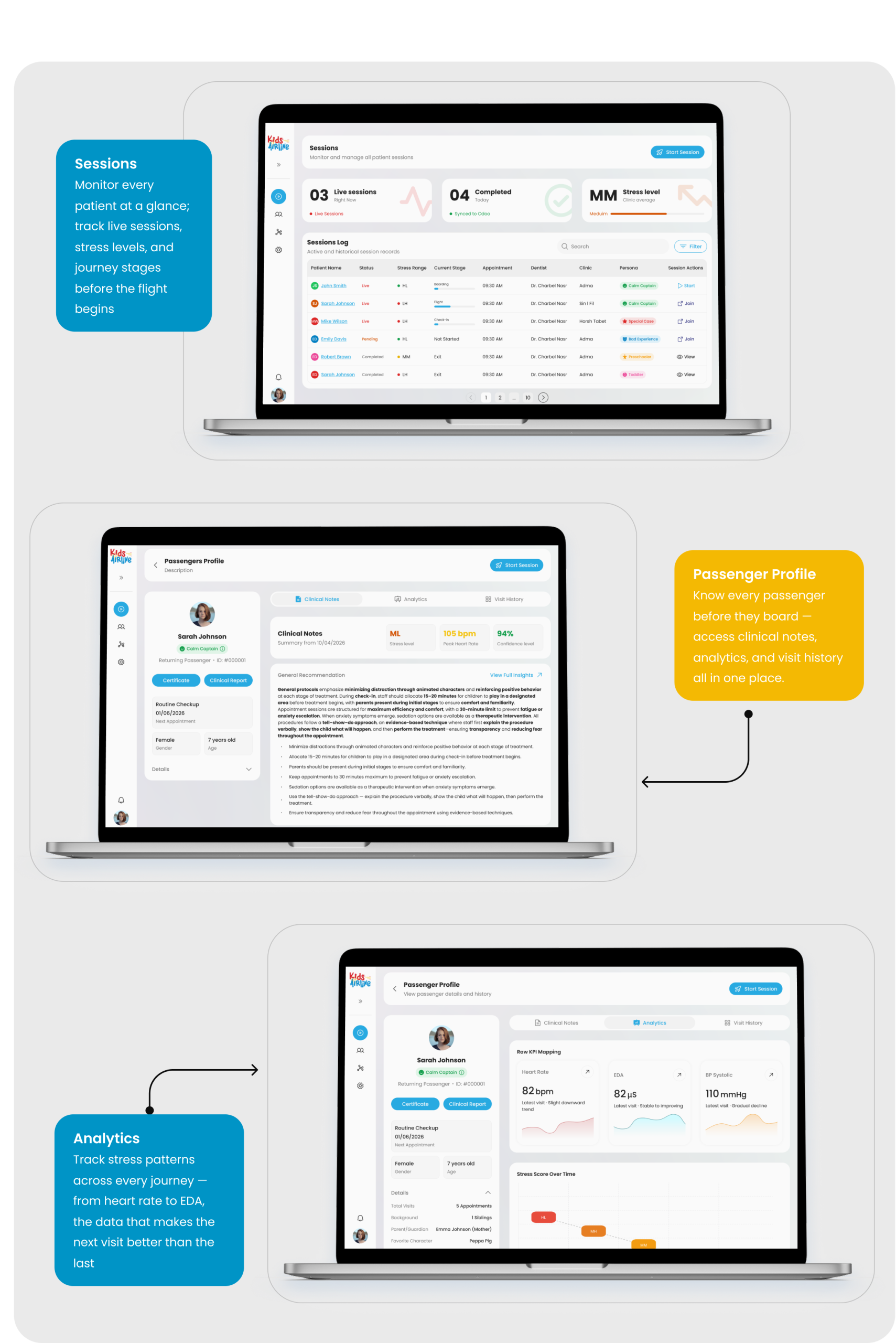
Every screen in Kids Airline is purpose-built for a specific moment in the clinical journey. The Sessions log gives the clinic director an at-a-glance operational view. The Session configuration prepares the clinician before a child enters. The live session screen brings together biometric data, journey stage, and clinical decisions in real time.
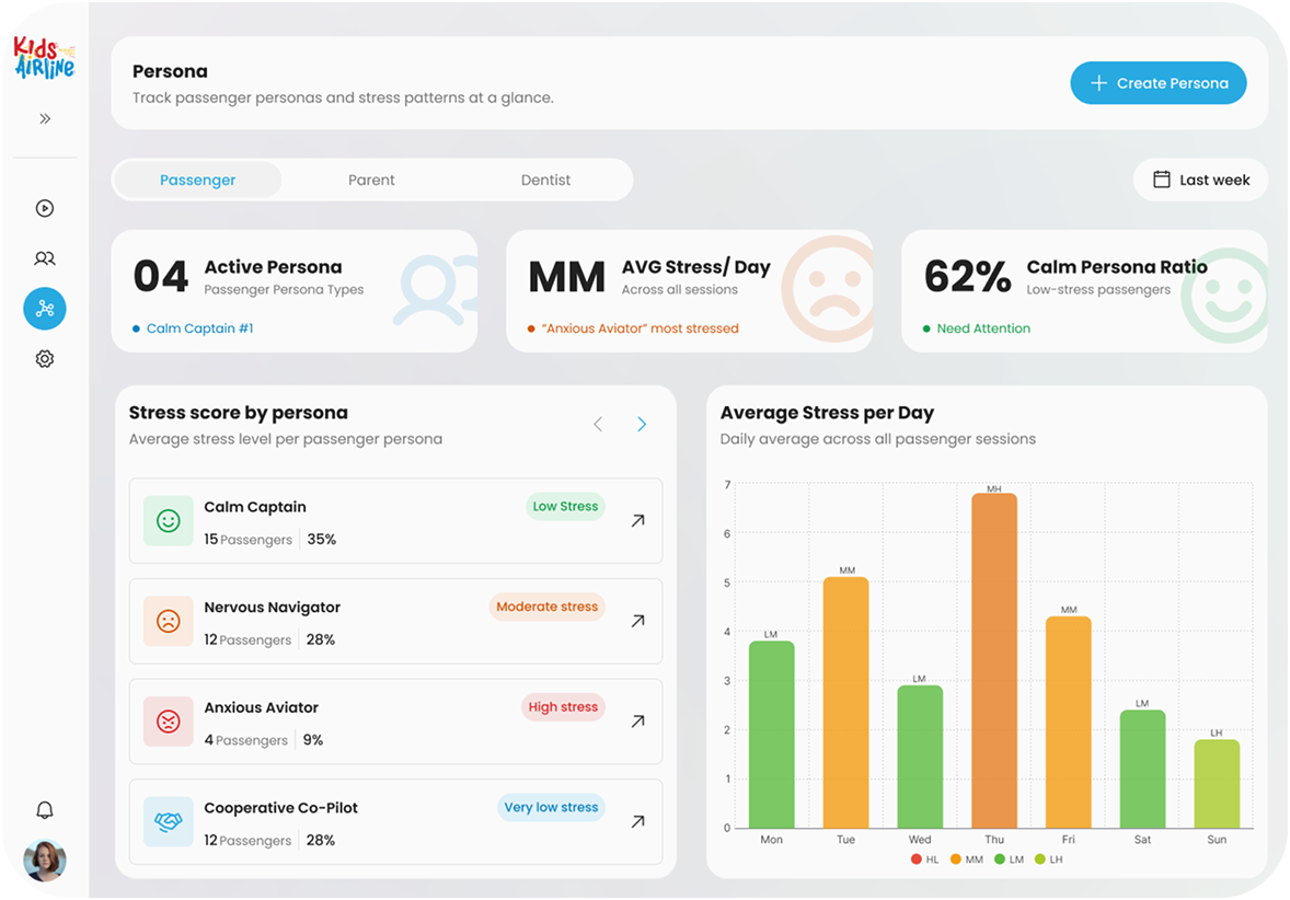
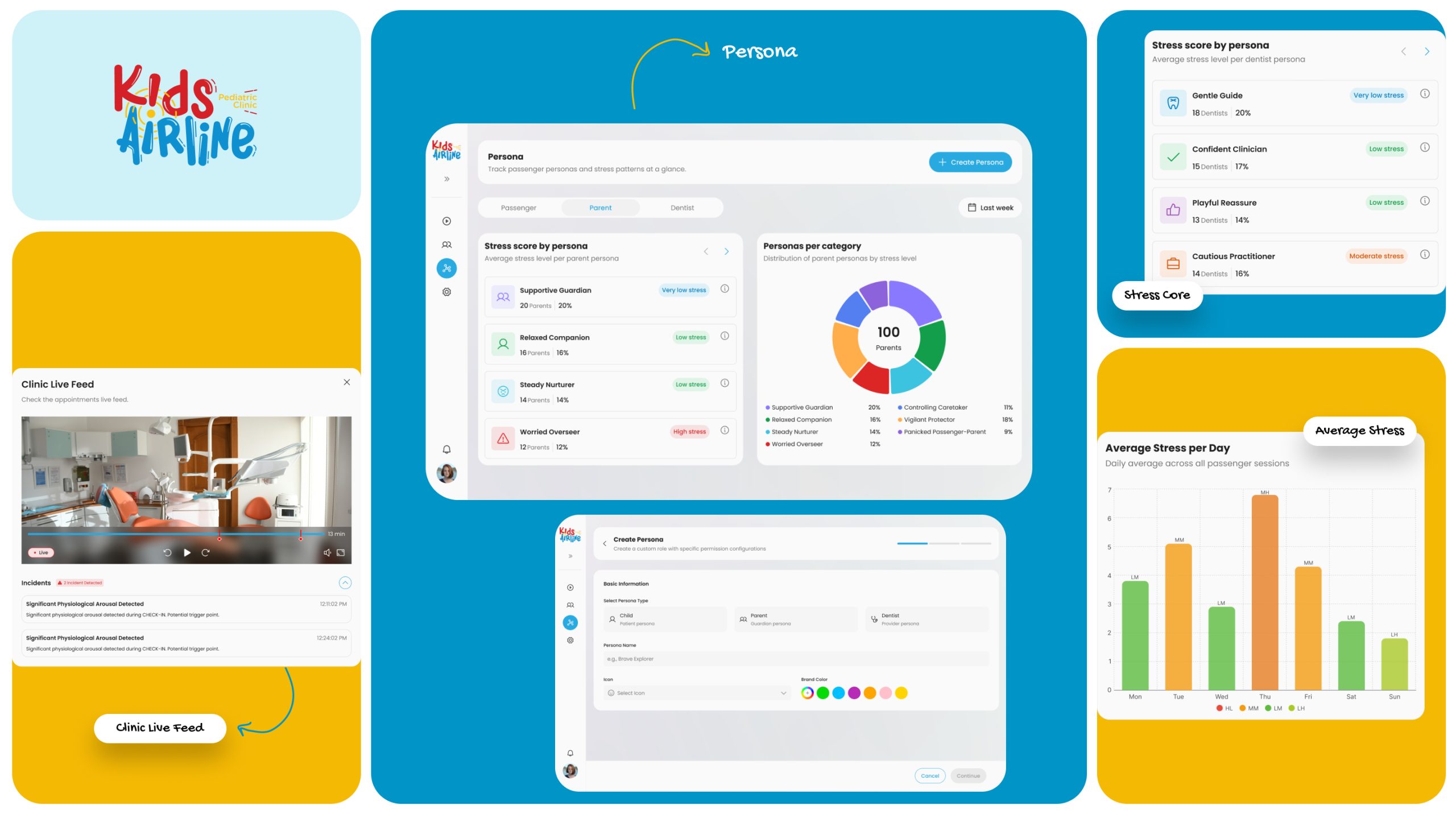
The Persona dashboard gives clinical leadership a longitudinal view across all patients — identifying which passenger archetypes are most stressed, and which intervention patterns are working over time.
Browse by mood, genre, or switch to live channels — all within one thumb-reach of the bottom navigation. RTL layout, bold poster cards, contextual episode detail, and a persistent gold play CTA guide users from discovery to playback in as few taps as possible.
Sessions Log. Operational overview
Live sessions count, completed today, average stress level. Below: a sortable table of every patient with status, stress range, journey stage, persona, and one-click session actions.
Session Configuration. Pre-flight checks
Before treatment begins, the clinician confirms treatment type (synced from Odoo ERP), context features, and who is accompanying the child. All data flows in — the clinician reviews and starts.
Live Session. Real-time clinical cockpit
Heart rate, EDA, BP Systolic streamed live. Stress score with high/medium/low classification. Incident alerts. Clinic live feed. Journey stage progress bar. Every piece of data the clinician needs, exactly when they need it.
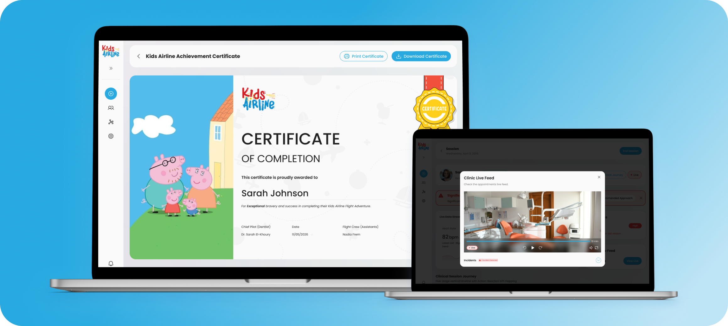
Live Session & Analytics
Real-time biometrics meet clinical judgment
The live session screen is the product’s most complex surface. It brings together streaming biometric data, stress classification, incident detection, and the clinical journey map — all in a single view the dentist can read in a glance without breaking eye contact with the child. The Session History screen gives the full post-session debrief: a longitudinal Full Journey Analytics chart showing heart rate and EDA across all four stages, incident markers, stress score, and a session recording timestamp. This is the data that informs the next visit.Live biometric stream
Heart rate (bpm), EDA (μS), and BP Systolic (mmHg) update continuously. Trend indicators (upward/downward/stable) tell the clinician not just the number but the direction.
Clinic Live Feed
The "View Live" camera feed overlay lets a supervising clinician monitor the treatment room from the dashboard without entering — reducing room disturbances for anxious patients.
Full Journey Analytics
Post-session chart mapping heart rate and EDA across Check-in, Boarding, Flight, and Exit — with incident markers overlaid. Every visit builds a longitudinal patient profile over time.
Delivery
One platform. Every stage of the child’s journey.
Kids Airline launched as a fully designed web dashboard — a single system that covers every moment of the pediatric dental experience, from session scheduling to post-visit analytics, powered by a clean design system and integrated with Odoo ERP for real clinical data.
- 5 Core screens designed
- 4 Journey stages mapped
- 5 Patient personas built
- 3 Live biometrics tracked
The approach
How we designed a product that had never existed before
Kids Airline had no direct precedent to benchmark against. No product combined pediatric anxiety management, live biometric monitoring, and clinical session tracking in a single interface. Rather than starting with user interviews, we built from two directions simultaneously: clinical research into child anxiety, and UX analysis of the products closest to the problem.
01
Mapped the adjacent landscape
Dental software, biometric dashboards, child health apps, and airline UX, four categories that each held a piece of the solution. We extracted the best patterns from each and combined them into a single coherent system.
02
Built the metaphor into the architecture
Check-in, Boarding, Flight, Exit, these four stages are not labels. They are the information architecture of the product. Every screen belongs to a stage, and every stage has a clinical purpose behind the playful name.
03
Designed data as a clinical language
Every metric on screen answers a question a dentist would ask in the moment: Is this child getting more anxious? When did the stress spike? What happened at that point in the journey? Data is only useful when it is answering the right questions at the right time.
What we learned
The metaphor is the product
Calling a dental appointment a 'flight' is not a naming exercise, it is a therapeutic intervention. When children understand they are on a journey with a clear destination, their anxiety decreases.
Clinicians need data that moves
A stress score means nothing if the clinician sees it five minutes after the spike. The dashboard was built around one rule: data must be live, or it has no clinical value
Clean design can still feel warm
Clinical software tends to be either cluttered or sterile. Kids Airline proved that a minimal design language can still feel human, through color logic, playful personas, and emoji-coded badges..
