
Client
BLF Bank

Service
UX UI Design
Industry
Banking
Date
Jan 2026

Not just a banking app
a smarter way for Lebanon to bank.

Discover

Understanding the problem space and aligning early direction
Before engaging with users, we explored the broader context of the challenge to align stakeholders and define a clear starting point. This phase focused on understanding business goals, constraints, and existing knowledge, while identifying early risks and opportunities.
What we uncovered
Trust Gap

Users didn't trust the app to complete transactions correctly leading them back to branches

Cognitive Overload

Too much information, poorly organized, with no clear visual hierarchy

Feature Blindness

Key features existed but were buried users couldn't find what they needed

Emphatize

Understanding the problem space and aligning early direction

we focused on understanding BLF users through direct research, uncovering their motivations, behaviors, and pain points to ground every design decision in real needs.

Mindsets
A closer look at key user groups to understand why users behave as they do.
Frame 1597880845
The Cautious Saver

Values security and stability above everything needs to trust every tap before confirming a transaction.

Frame 1597880847
The Busy Professional

No time for branch visits expects banking to work fast, clearly, and without friction.

Frame 1597880846
The Daily Spender

Uses the app constantly for small transactions needs instant feedback and full spending visibility.

Frame 1597880846-1
The Family Manager

Handles multiple accounts and responsibilities needs organization, overview, and control in one place.

Frame 1597880846-2
The Lebanese Expat

Managing money across borders needs seamless transfers and multi-currency clarity.
Discovery activities
Interviews
0 +
Survey responses
0 +
End-to-end experience map
0

Define

Finding clarity in the research

In this phase, we distilled research insights into clear problem statements, aligning the team on the most critical user needs and opportunities, and setting a focused, user-led direction for what to solve next.

What we uncovered
Trust before features

Users didn't need more features they needed to trust the ones already there. Unclear feedback states and missing confirmation moments were the root cause of branch dependency.

Complexity dressed as simplicity

The existing app looked clean on the surface but buried critical actions under confusing navigation patterns forcing users to memorize paths instead of discovering them naturally.

Banking in two languages, one experience

Lebanese users think and communicate in Arabic and French simultaneously yet the app treated language as a toggle, not a design principle. Tone, labels, and microcopy all needed rethinking.

Prototype

Removing hesitation from the start

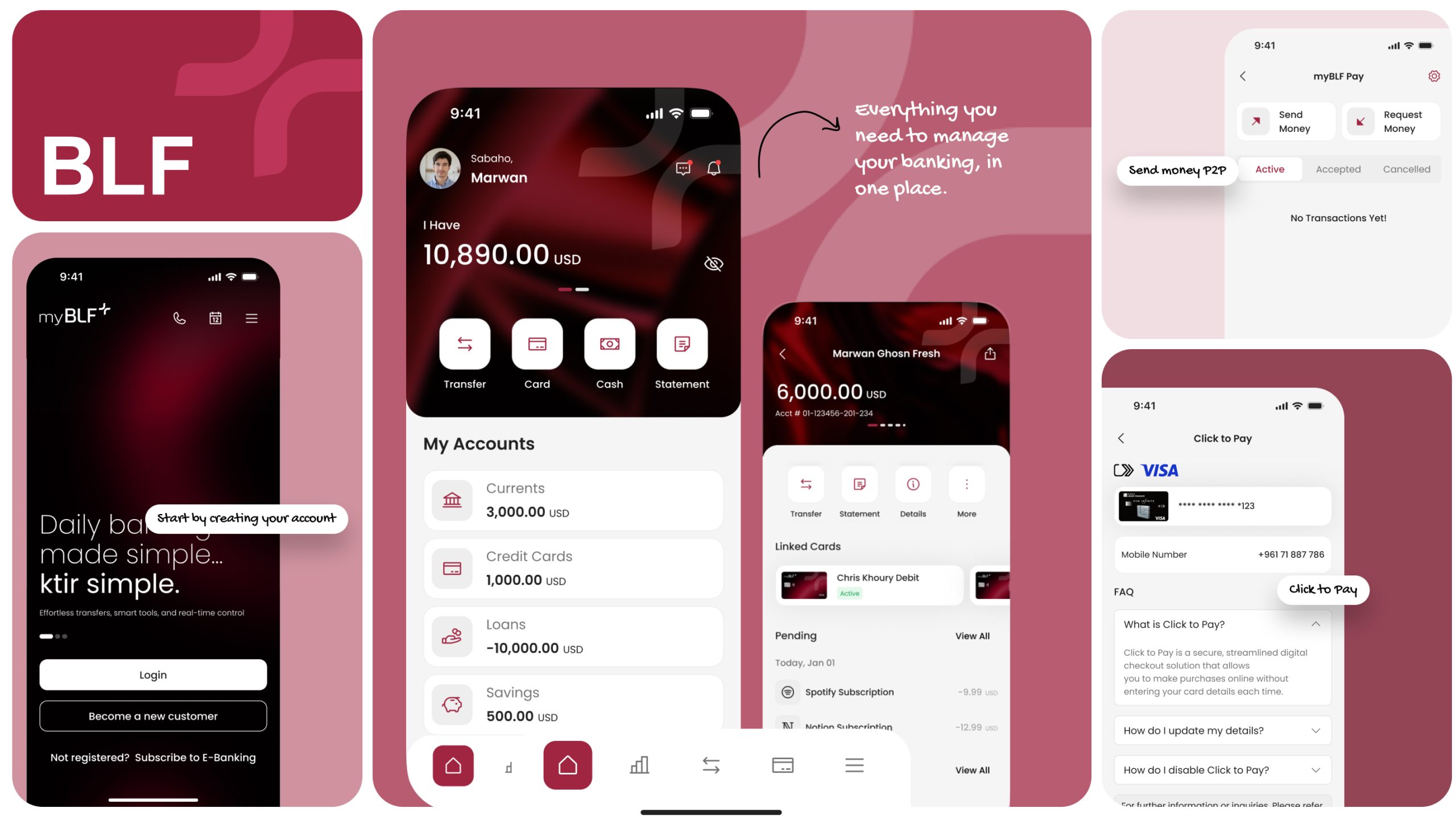
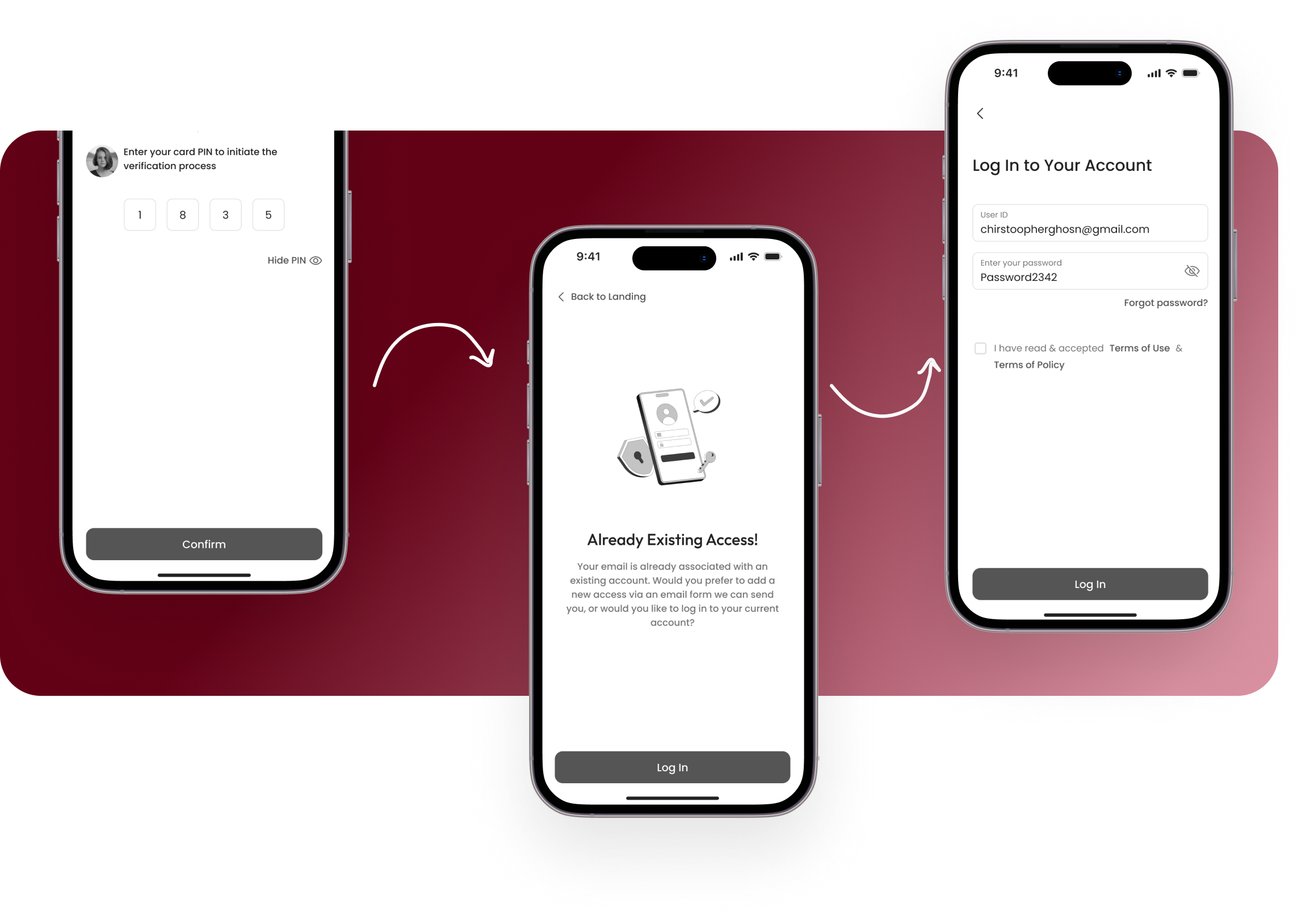
The myBLF onboarding experience was designed to eliminate friction before users even reached the app. Instead of overwhelming users with forms and steps upfront, we focused on building immediate confidence through biometric login, clear progress indicators, and a setup flow that felt personal from the very first screen.

During ideation, we restructured the entire myBLF experience around how users think and move not how the bank’s internal departments are organized. Every navigation decision, content grouping, and flow sequence was validated against real user mental models before a single screen was designed.

The approach

This project began with a simple question: what needs to be true for myBLF to work for both users and the bank? Rather than rushing into screen design, the focus was on building shared understanding, making research visible, and validating every decision before committing to it.