
Client
MBC
Service
User Interface
Industry
Media
Date
Oct 2025
Al Thaqafiya isn't just a news portal,
it's a cultural identity.
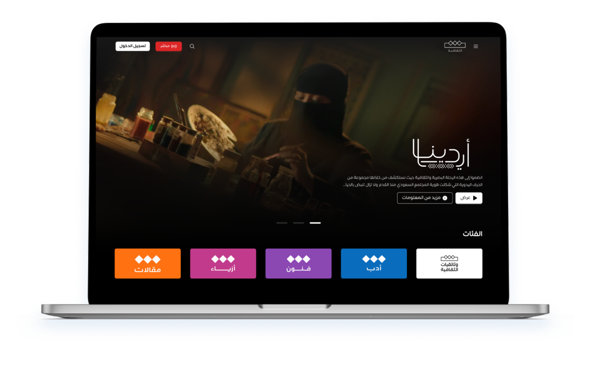
Benchmarking
Understanding the Arabic cultural media landscape
Before designing a single screen, we mapped the competitive field of Arabic-language digital media and international cultural news platforms. We studied how they handle content hierarchies, editorial layout, RTL navigation, live broadcast integration, and the balance between dense information and readability.This benchmarking phase replaced formal user research with applied competitive intelligence — understanding the conventions Arabic audiences already trust, and identifying where Al Thaqafiya could set itself apart.
Editorial hierarchy is everything
Leading Arabic portals structure content with a clear visual weight system — hero story, secondary grid, trending list. Readers scan before they read.
Phase shapes contentBrand accent as editorial identity
A single strong accent color (red for MBC, blue for Sky News Arabia) makes media brands instantly recognizable. Consistency across all states builds brand trust.
Article readability is under-designed
Most Arabic news portals sacrifice reading experience for ad density. An opportunity exists for a cultural platform to invest in editorial typography and spacing.
Discovery highlights
Platforms Studied
A closer look at Arabic media and cultural portals
We benchmarked seven platforms across Arabic news media, cultural portals, and international editorial references — studying their content grids, navigation patterns, article layouts, and how they surface trending and live content.The goal was not to copy any one platform but to extract the patterns that Arabic-speaking audiences are already conditioned to trust, then elevate them with a distinctive cultural voice.
From signals to themes
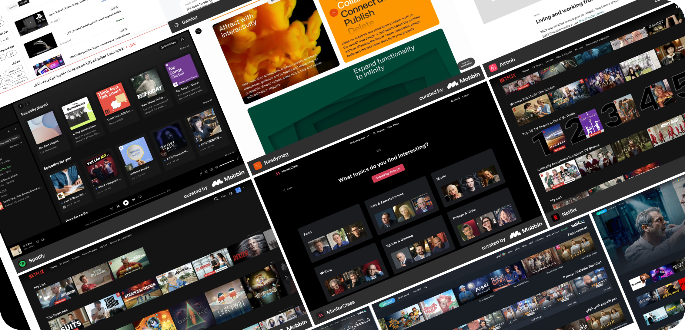
MBC
Arabic media giant, nav patterns
Sky News Arabia
Breaking news layout
Al Jazeera
Editorial depth
Arabia.com
Cultural content model
BBC Arabic
RTL UX excellence
Discovery activities
Design System
A visual identity rooted in Arabic culture
From benchmarking emerged a clear direction: bold, editorial, and culturally grounded. Al Thaqafiya’s design system uses a striking pink-magenta accent to cut through the visual noise of the Arabic media landscape — distinctive, memorable, and RTL-native from the ground up.
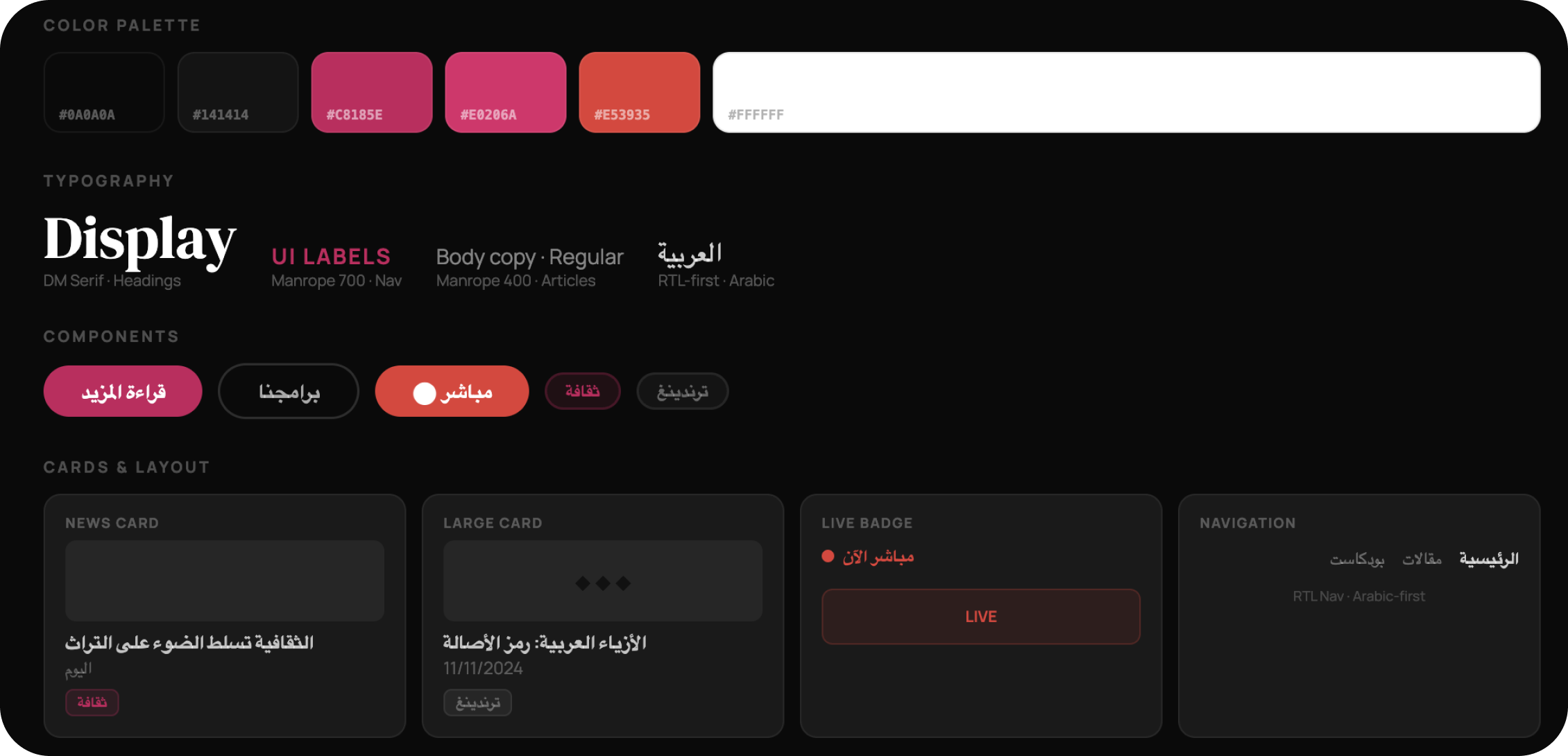
Pink as cultural authority
In a landscape of red (MBC) and blue (Sky News), pink-magenta positions Al Thaqafiya as bold and distinctive — cultural without being conservative.
Editorial grid discipline
A strict column grid with deliberate card weights — hero, primary, secondary, sidebar — creates clear content hierarchy that readers scan intuitively.
RTL-native from the ground up
Navigation, article layout, card alignment, and reading flow all built right-to-left. Arabic is not a translation layer — it is the design language.
News Homepage
Content discovery through editorial hierarchy
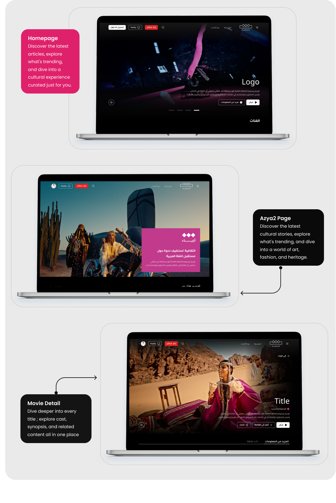
The homepage is a curated editorial experience, not a content dump. A full-width hero slider leads with the most culturally significant story. Below, three distinct content zones — Latest Articles, Trending, and Chosen For You — each use different card formats to create visual rhythm and guide reading flow.
Full-width hero slider
Featured story leads with a cinematic full-bleed image, Arabic headline overlay, and a single CTA. Carousel dots for navigation. Sets the editorial tone immediately.
Latest Articles
4-column news card grid with thumbnail + headline + category. Scannable at a glance. "عرض الكل" (View All) for deeper navigation without overwhelming the fold.
Trending band
Dark background section with a split layout: 4 compact list cards on the right, one large feature card with image on the left. Creates maximum density without clutter.
The black “Trending” band breaks the white page into clear content chapters, borrowing a pattern from magazine editorial design — giving the homepage a sense of structure rather than infinite scroll.
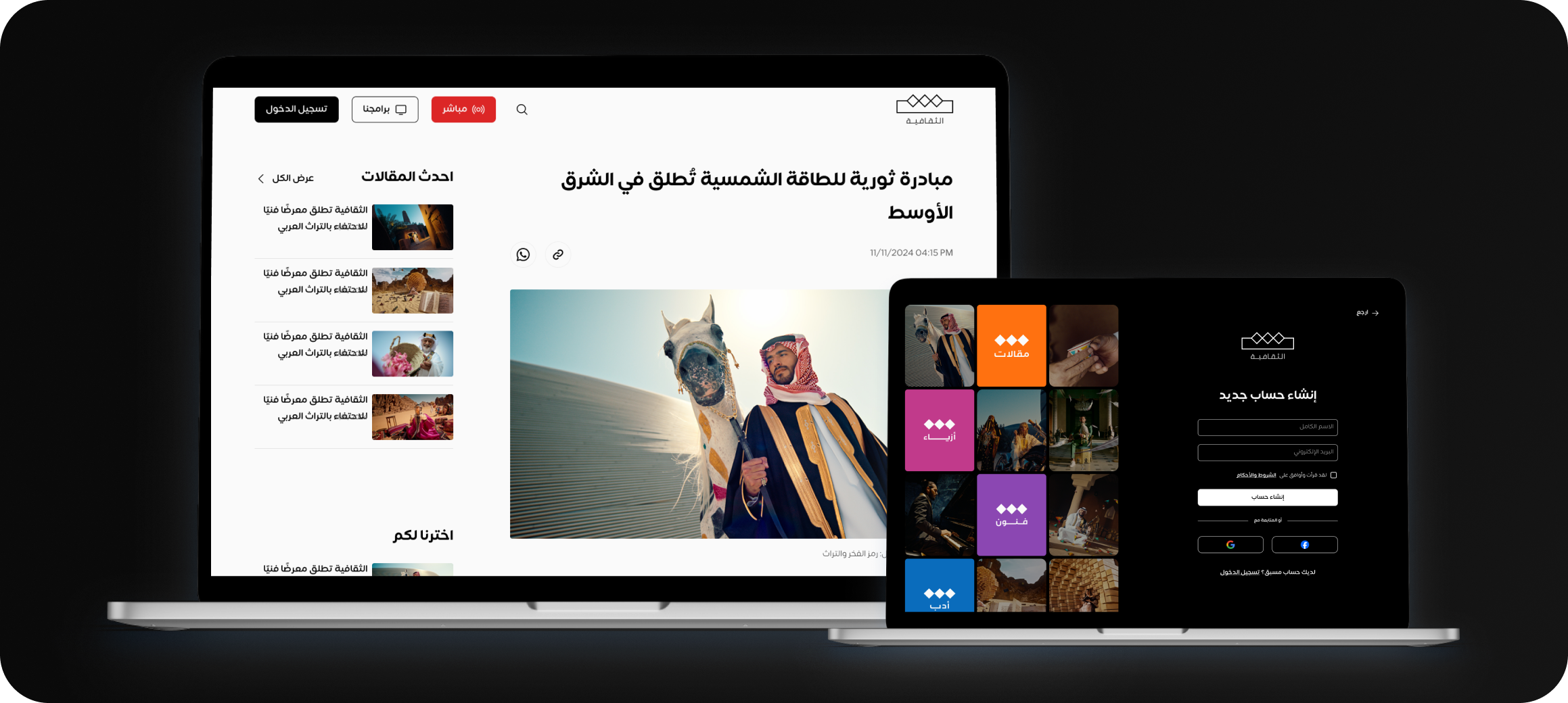
Article & Program Detail
Two templates. One consistent experience.
The platform serves two distinct content types — written articles and broadcast programs — each requiring its own page template. Both share the same navigation system, footer, and design language, but the content layout is purpose-built for each format.
The article detail prioritises reading comfort: wide body column, sidebar with related content, clear author attribution. The program detail is hero-video-first with cast, broadcast schedule, and episode information surfaced immediately below the fold.
Article Detail ; Reading first
Wide centered body with pull quotes. Sidebar carries "احدث المقالات" and "اخترنا لكم" — keeping readers inside the platform after finishing an article.
Program Detail ; Video hero
Full-width cinematic still with title overlay, broadcast schedule badge (الجمعة والسبت), and three quick-action CTAs: Watch Episode 1, Add to List, Share.
Tabs: More Info / Related
Program detail uses a tab system for المزيد من المعلومات (cast, director, genre) and ذات علاقة (related content) — reducing scroll length while keeping all data accessible.
Delivery
Three platforms. One cohesive product.
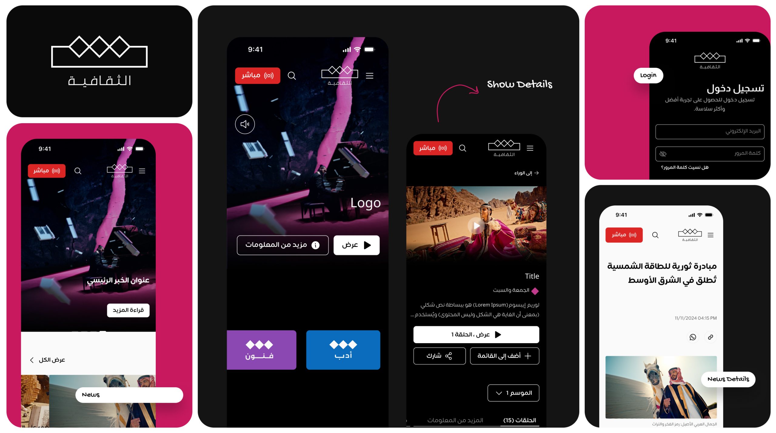
Al Thaqafiya launched as a fully designed website with three purpose-built page templates — Homepage, Article Detail, and Program Detail — all powered by a single RTL-native design system with shared navigation, footer, component library, and color language.
- 3 Page templates designed
- 51+ Total screens & states
- 01RTL design system
- 30+Reusable components
The approach
How we designed a cultural media platform without traditional research
Al Thaqafiya needed a product that felt authoritative, culturally grounded, and distinctly different from the crowded Arabic news landscape. Rather than starting with user interviews, we started with competitive intelligence — studying the best of Arabic and international media design, then applying those insights to a fresh RTL-native system.
01
Mapped the competitive landscape
We studied MBC, Al Jazeera, Sky News Arabia, BBC Arabic and others — focusing on navigation patterns, content hierarchy, live broadcast integration, and RTL layout decisions.
02
Built three purpose-built templates
Homepage, Article Detail, and Program Detail — each designed for its specific content type, yet sharing a unified design system: one set of tokens, one component library, consistent RTL logic.
03
Established a distinct cultural identity
Pink-magenta in a sea of red and blue Arabic media. Bold, editorial, and unmistakably Al Thaqafiya — a brand accent that works as a functional UI signal and a cultural differentiator simultaneously.
What we learned
Editorial Rhythm Builds Trust
Arabic readers rely on familiar content hierarchy. A clear structure creates trust, improves navigation, and strengthens the reading experience.
Live Content Drives Engagement
Live access should remain visible and immediate. Prominent placement reduces friction and encourages continuous audience engagement.
Reading Experience Matters
Clear structure, comfortable spacing, and refined typography create a more engaging reading experience and encourage longer sessions.
