Client
Group Alballam
Service
User Interface
Industry
Media
Date
Dec 2024
Alballam isn’t just a VoD platform,
it’s a system of trust.
Benchmarking
Understanding the streaming landscape and setting direction
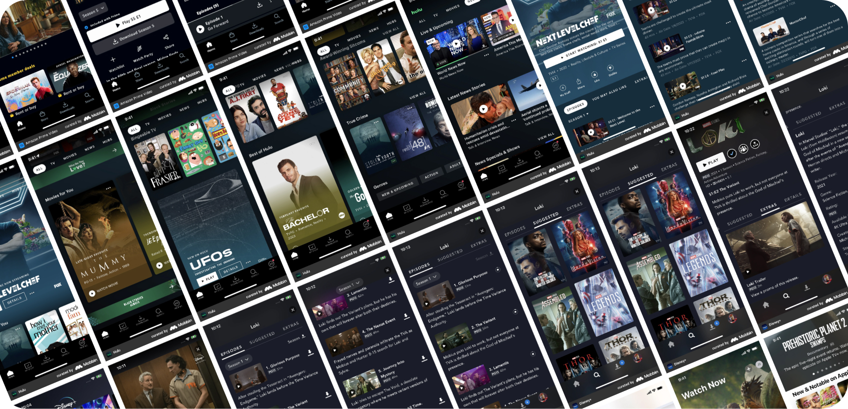
Before we touched a single pixel, we mapped the competitive field. Netflix, Disney+, Apple TV+, Prime Video, and StarzPlay were dissected screen by screen — navigation, content discovery, episode flows, player controls, and multi-device sign-in. This phase replaced formal user research with applied competitive intelligence: the same outcomes, a different path.
What we uncovered
Content-first navigation
Leading platforms put content front and center. Navigation is invisible until needed — the content IS the interface. No mandatory onboarding.
Multi-device continuity
Users start watching on mobile and finish on TV. Seamless cross-device handoff is a baseline expectation — not a premium feature.
Frictionless access
Every extra tap to first content costs retention. The fewer steps between opening the app and pressing play, the higher the engagement.
Discovery highlights
Platforms Studied
A closer look at the streaming giants
We went deep into five of the world’s most successful streaming platforms to understand the patterns users are already trained on. The goal was not to copy — it was to identify the conventions that earn trust, and the whitespace where AlBallam could differentiate.
Netflix
Content rows & hero layout
Disney+
Premium brand language
Apple TV+
Editorial minimal UI
Prime Video
Dense catalogue + live
StarzPlay
Regional Arabic UX
Design System
Turning insight into a unified visual identity
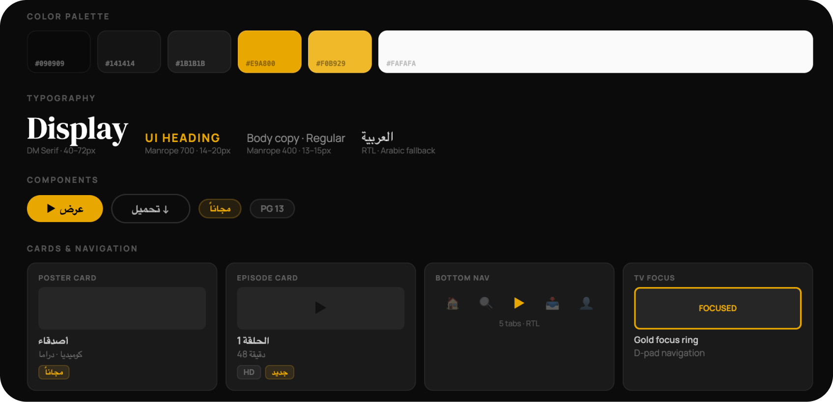
From benchmarking emerged a clear direction: dark, cinematic, and RTL-native. AlBallam’s design system was built to work across all three platforms from day one, one token set, one component library, three screens.
Content-first navigation
Leading platforms put content front and center. Navigation is invisible until needed — the content IS the interface. No mandatory onboarding.
Multi-device continuity
Users start watching on mobile and finish on TV. Seamless cross-device handoff is a baseline expectation — not a premium feature.
Frictionless access
Every extra tap to first content costs retention. The fewer steps between opening the app and pressing play, the higher the engagement.
Mobile App
Designing for thumb reach and content discovery
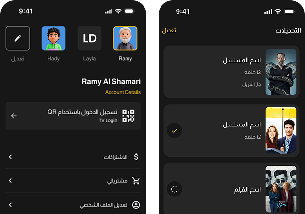
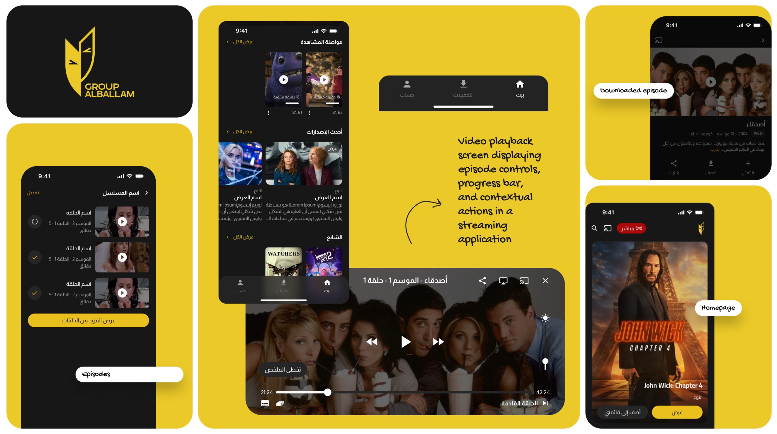
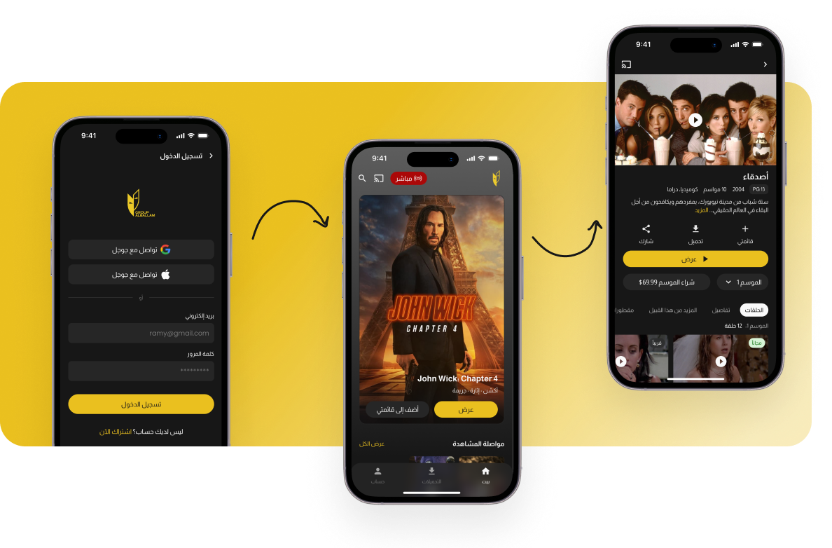
The mobile app is the primary touchpoint. It had to feel fast, familiar, and distinctly AlBallam. Information architecture follows how users think, not how the content library is organised internally.
Browse by mood, genre, or switch to live channels — all within one thumb-reach of the bottom navigation. RTL layout, bold poster cards, contextual episode detail, and a persistent gold play CTA guide users from discovery to playback in as few taps as possible.
Smart TV
The 10-foot experience
Designing for Smart TV demands a completely different interaction model. No hover, no touch, only D-pad navigation and focus states. Every element had to be immediately clear from across the room: minimum 18px type, high-contrast gold focus rings, deliberate spatial layout.
Sign-in was solved with a dual-path approach: scan a QR code from the mobile app in seconds, or enter credentials manually. No friction for new users. Instant for returning ones.
D-Pad Navigation
Every screen was mapped against directional paths. No dead ends, no focus traps. Every element reachable within 3 directional moves.
QR Code Sign-In
Open the mobile app, open Settings, scan. The TV logs in instantly, zero keyboard use, zero frustration, borrowed from Apple TV's best-in-class flow.
Gold Focus Ring
A consistent gold border highlights the focused element on every screen — the single, unambiguous signal of where the user is at all times.
Delivery
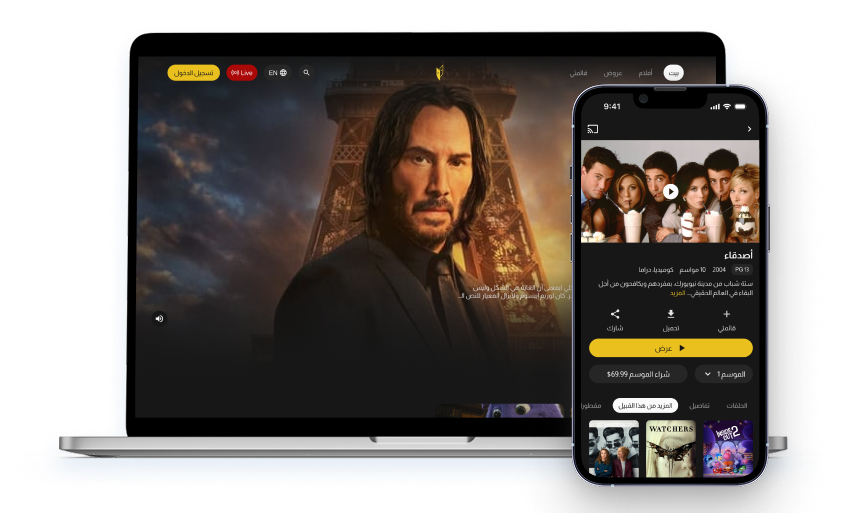
Three platforms. One cohesive product
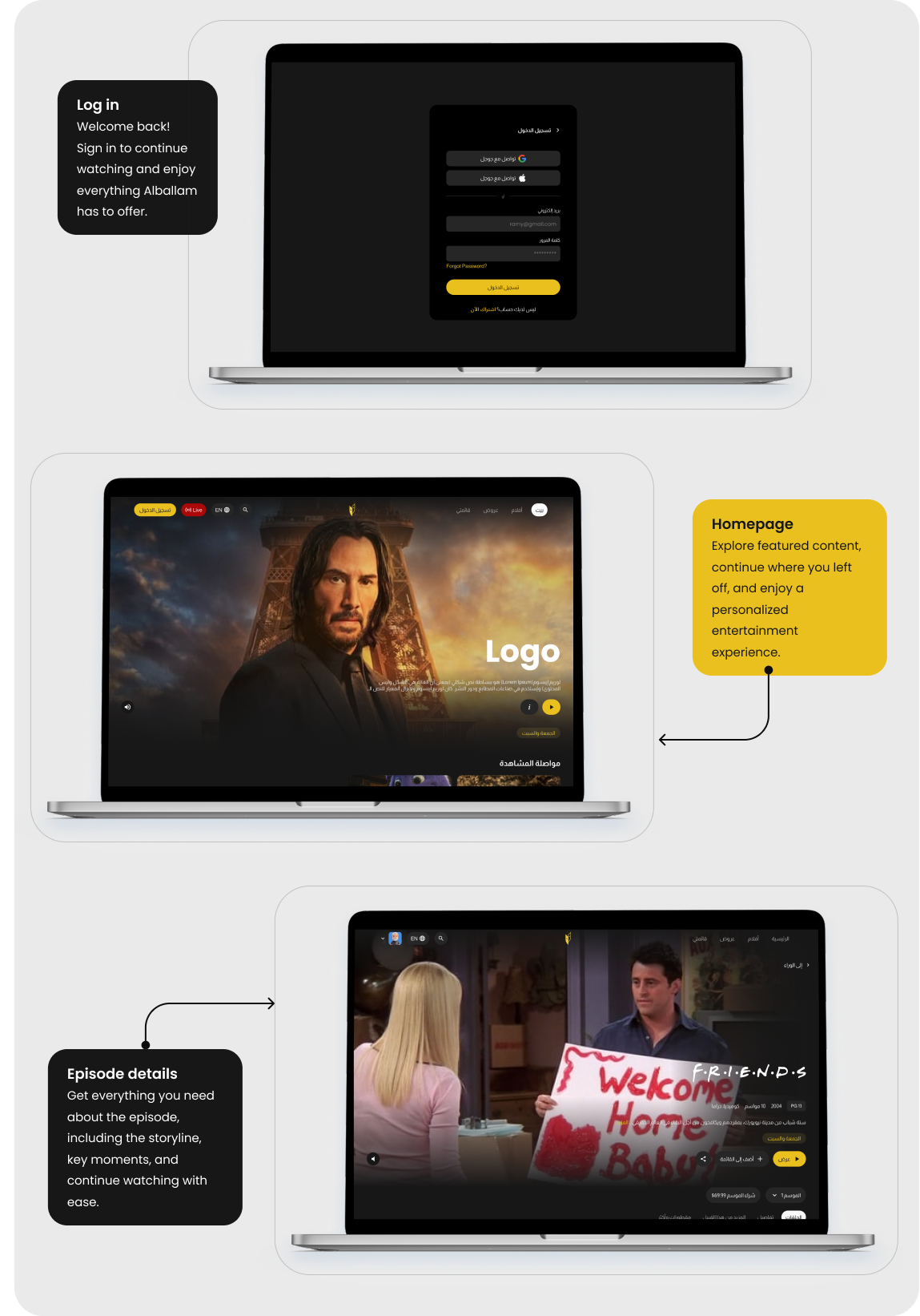
AlBallam launched as a fully designed, multi-platform product. A single design system powering mobile, web, and Smart TV. Every screen, every component, every interaction shares the same visual DNA — black surfaces, gold signals, and RTL-native layout throughout.
- 3 Platforms designed (Mobile · Web · TV)
- 81% Total screens delivered
- 01 Unified design system
- 40+ Reusable components built