Arabic RTL UX Design: A 25-Point Checklist for Bilingual Products
An Arabic RTL UX design checklist for bilingual products: 25 points on mirroring, typography, numerals, bidirectional text, icons, forms, content and testing.
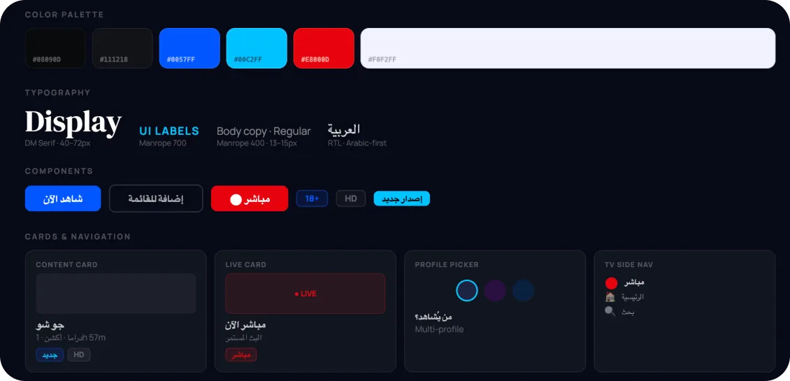
Arabic RTL UX design is not a mirrored copy of an English interface. It is a second first-class version of the product, with its own type system, number conventions, reading order and tone, decided at the wireframe stage rather than flipped at the end. This checklist sets out the twenty-five decisions we make on every bilingual Arabic-English product we design for Saudi Arabia, the UAE and the wider GCC.
Why Arabic-first beats Arabic-last
Most bilingual products in the Gulf were designed in English and localised afterwards. You can see it in the details: labels that truncate, icons pointing the wrong way, numerals that switch system between screens, and error messages that read like machine translation. Each one is small. Together they tell Arabic-speaking users that the product was not really built for them.
The alternative is to design the Arabic version first, or at least in parallel, so every component is tested in both directions before it ships. When we designed an Arabic-first streaming platform across mobile, TV and web for Shasha, the right-to-left layout was the primary design, which forced the hard decisions about type, numerals and navigation early, when they were cheap to make.
Use the groups below as a review list for any bilingual app design in Arabic and English, whether you are starting fresh or auditing something live.
Layout and mirroring
- Mirror the structure, not just the text. Navigation, progress indicators, primary actions, back and forward controls and reading order all move to the opposite side. Build with logical properties (start and end) rather than left and right so the switch is one attribute, not a second stylesheet.
- Decide what does not mirror, and write it down. Media playback controls, timeline scrubbers, phone numbers, clocks and charts with a time axis usually stay left-to-right. Document the exceptions in the design system so nobody re-argues them.
- Re-check every mixed component. Cards with an image on one side and text on the other, list rows with trailing chevrons, badges attached to avatars and truncated text all need the ellipsis, the badge and the chevron on the correct edge.
- Review each breakpoint in both directions. A desktop grid mirrors cleanly. A mobile bottom sheet with a swipe gesture, a side drawer or a carousel often does not.
Typography
- Pair typefaces deliberately. Choose an Arabic typeface designed as a companion to your Latin face, or pair two with similar weight, rhythm and contrast. Many system defaults look fine in isolation and wrong beside their Latin partner.
- Give Arabic more size and line height. At the same point size Arabic reads smaller and its ascenders and descenders vary more, so set it a step larger with generous leading. Test paragraph and label styles separately.
- Never fake emphasis. Letter-spacing breaks connected Arabic letterforms, and synthetic italics distort them. Use weight, colour and size for hierarchy instead.
- Design for both lengths. Arabic and English strings rarely match in width. Buttons, tabs, table headers and navigation labels need room for the longer of the two, and truncation rules that work in both.
Numerals, dates and currency
- Choose a numeral system per locale and hold to it. Arabic-Indic digits and Western Arabic digits are both in daily use across the Gulf, and preference varies by country, audience and context. Let UX research with your actual users decide, then apply the decision everywhere, including charts and notifications.
- Support Hijri alongside Gregorian where it matters. Government, legal and some banking contexts in Saudi Arabia expect both calendars. Date pickers, statements and deadlines should show the one the user expects, with the other available. Remember that the weekend is Friday and Saturday.
- Keep amounts readable. Position currency codes and symbols according to locale, keep the digits themselves left-to-right, and make sure negative signs, decimal separators and thousands separators do not detach from their numbers when direction flips.
Bidirectional text
- Isolate embedded Latin. Product names, email addresses, URLs, promo codes and model numbers inside Arabic sentences need bidirectional isolation so that surrounding punctuation lands where a reader expects it.
- Let user content set its own direction. Inputs, comments, chat messages and search queries should detect direction automatically. An English message inside an Arabic conversation should align to the left.
- Test punctuation at the edges. Question marks, commas, brackets and quotation marks mirror in Arabic. Strings that end in a Latin word followed by punctuation are where the layout usually breaks.
Icons and motion
- Mirror what implies direction. Back arrows, chevrons, send, undo and redo, next-step controls and progress indicators flip. Search, clock, tick, settings, logos and playback icons do not.
- Mirror motion too. Page transitions, carousels, swipe-to-dismiss and onboarding progress should travel right-to-left. Animation that moves the wrong way feels broken even when the layout is correct.
- Check illustrations for reading order. A three-panel illustration or a numbered diagram reads right-to-left in Arabic. If it cannot be rebuilt, it needs a different composition.
Forms
- Align everything to the start edge. Labels, inputs, helper text, error messages and in-field icons follow reading direction. Phone numbers, card numbers, IBANs and one-time codes stay left-to-right inside a right-to-left form.
- Validate Arabic input properly. Names in Arabic script, national ID and Iqama numbers, Emirates ID formats and mixed-script addresses must all pass validation. Watch for variant letterforms such as the different alef and yaa shapes, and never reject Arabic characters as invalid.
- Order fields for the mirrored layout. Focus order, tab order and keyboard navigation follow reading order. Error summaries should list fields in the order the user sees them.
Content and tone
- Write Arabic, do not translate English. Interface copy should be drafted by a writer who works in Arabic, with a register that suits Gulf audiences. Decide early how the product addresses the user, because Arabic is gendered and the choice shapes every string.
- Build a bilingual glossary into the design system. Every term (account, wallet, order, request, dependant) should have one agreed Arabic equivalent used by product, marketing and support alike. A design system that includes the glossary stops drift between teams.
Testing
- Test with native speakers, not bilingual colleagues. Recruit Arabic-first users in Saudi Arabia and the UAE whose devices are set to Arabic. Bilingual team members have learned to tolerate what first-time users will not.
- Test with the operating system in Arabic. System dialogs, keyboards, share sheets, notifications and permission prompts all change when the device language is Arabic, and they interact with your layout in ways a language toggle inside the app will never reveal.
- Automate the direction check. Document every component in both directions, add right-to-left states to visual regression tests and make the direction switch a one-line toggle in your component library so no release ships with an untested Arabic layout.
Frequently asked questions
Is Arabic UX design just mirroring an English layout?
No. Mirroring handles structure, but typography, numerals, calendars, bidirectional text, content tone and testing all require separate decisions. A product that only mirrors will look right at a glance and feel wrong in use.
Should a bilingual app use Arabic-Indic or Western numerals?
Both are in common use across the GCC, and the right choice depends on country, audience and context. Research it with your own users, then apply the decision consistently across every screen, chart and notification.
When should RTL design start in a project?
At the first wireframe. Deciding direction, type and numerals early costs almost nothing. Retrofitting them into a finished English product touches every component and usually leaves the Arabic version visibly second-class.
If you are planning or auditing a bilingual Arabic-English product, talk to us about where to start.