The full experience, edge cases included
Onboarding, errors, empty states, offline moments and the long tail of real usage are designed, not discovered in production.
Product design
We create seamless, thoughtful products that people love and businesses rely on.
What’s included
Outcomes
Onboarding, errors, empty states, offline moments and the long tail of real usage are designed, not discovered in production.
Everything we deliver is built as components and documentation your designers and engineers can keep using without calling us back.
Web, iOS, Android and TV share one visual language and one set of rules, including Arabic and English layouts.
How it works
Research, analytics and stakeholder interviews establish what the product must do and for whom.
Flows, information architecture and wireframes settle the structure before any visual work begins.
High-fidelity interfaces, interaction patterns and motion, built on a component system from day one.
Clickable prototypes go in front of real users and let testing settle the arguments opinion can't.
Production-ready specs, tokens and documentation, then design review of the build until launch.
We design the full experience, edge cases included, and hand it over as a system your team can extend without us. Clear structure, clean handoff and a real understanding of the constraints engineers work under are what our clients mention first.
That means every screen arrives with its states, every component with its rules, and every interaction with the motion that explains it. It also means we are in the room during implementation, reviewing builds so the product people use is the product we designed.
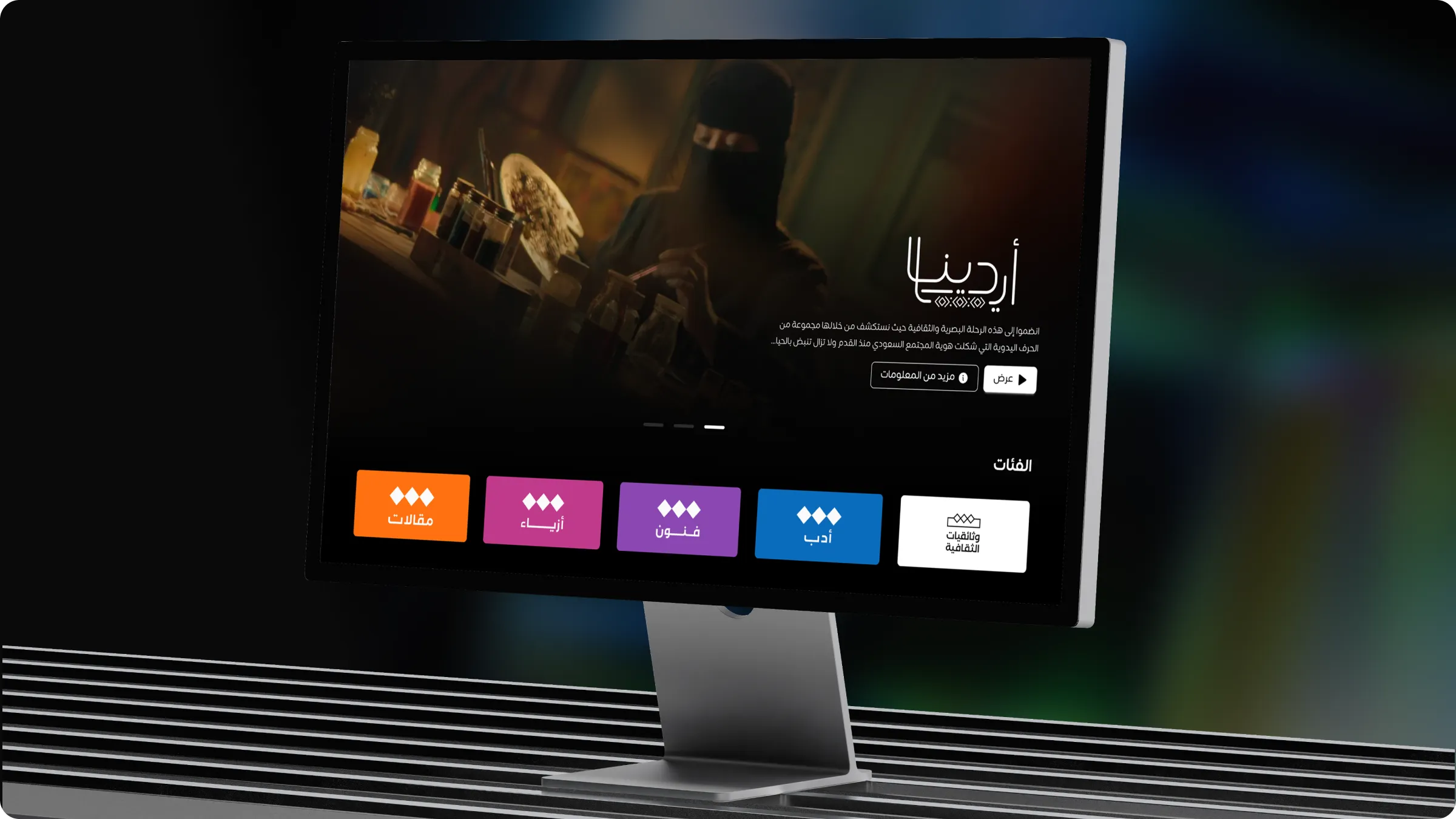
For the Middle East, product design is bilingual design. We design Arabic and English together: mirrored layouts, bidirectional text in lists and tables, numerals and dates, and typography pairings that hold up at every size. When Arabic is the primary market, we design it first and adapt English from it, not the reverse.
We design mobile apps for iOS and Android, from first flows to the final pixel. Each app is grounded in research with the people who will use it, then shaped into interfaces that respect platform conventions (navigation, gestures, system controls) while sharing one design system across both. Arabic and right-to-left apps are designed natively, not mirrored at the end, with Arabic typography, bidirectional content and numerals handled from the first wireframe.
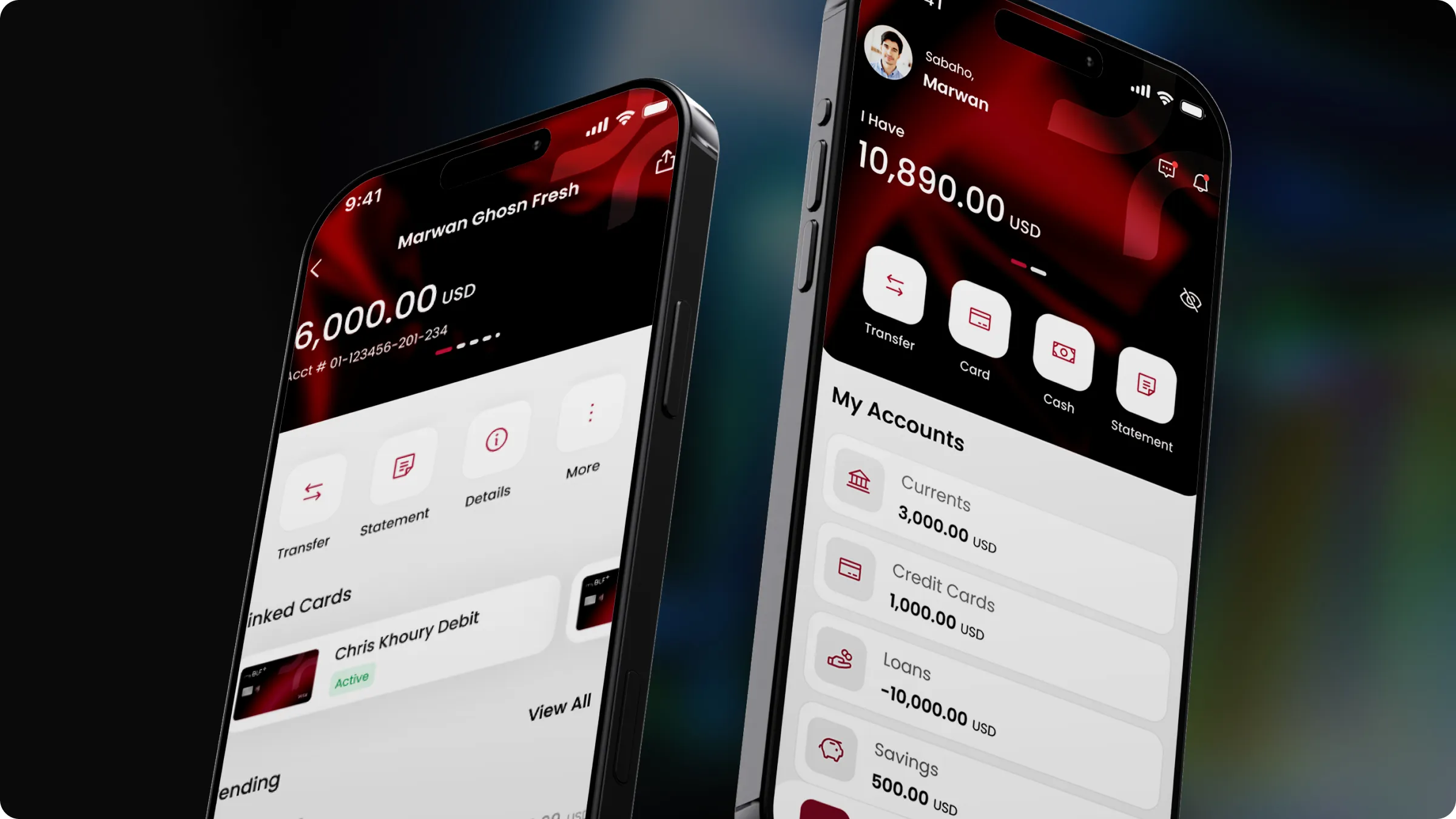
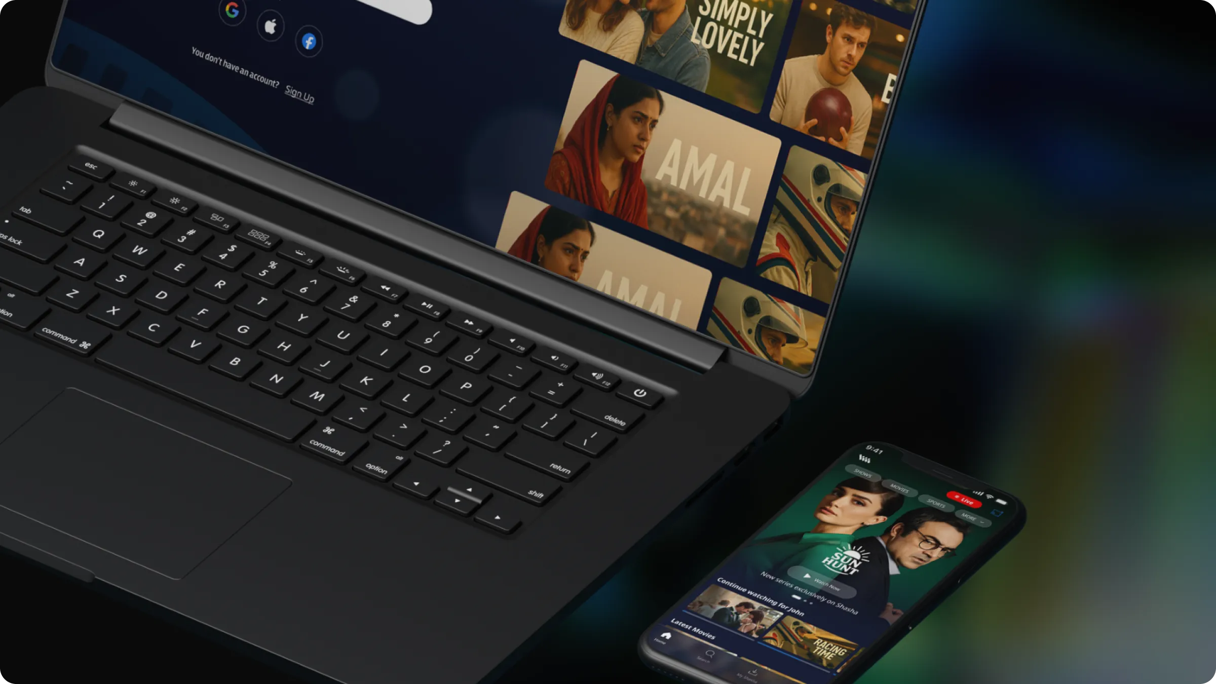
We are a design partner, not a development shop: we work with your development team or a trusted build partner, handing over specs, tokens and components they can build from, and reviewing the build until it ships. See how we approached it for MyBLF, BLF Bank’s mobile banking app, and for the Shasha streaming platform across mobile, TV and web.
Whether you are starting with a sketch or a product that has outgrown its interface, we take it from thinking to shipped. Research sets direction, prototypes settle debates, and a design system keeps the whole team moving at the same speed long after launch.
Related work
FAQ
Yes. Most of our engagements span web, iOS and Android, and several (like the streaming platforms we have designed) add smart-TV interfaces as well. We design the shared system first, then the platform-specific behaviour.
Absolutely. We are built to integrate, not replace. We work inside your Figma libraries and component conventions, adapt to your handoff requirements and extend or tidy the system where it needs it, without disrupting what already works.
Annotated Figma files, design tokens, component specifications with every state, interaction and motion notes, and a short walkthrough. We then review the build as it progresses so what ships matches what was designed.
We stay close after launch, refining and improving based on how real users actually behave. Post-launch support is scoped as a lightweight retainer so you have a design partner, not a hand-off.
Yes. We design native and cross-platform apps for iOS and Android, respecting each platform's conventions where they matter (navigation, gestures, system controls) while keeping one shared design system. Arabic and right-to-left apps are a core part of our work, as with the MyBLF banking app and the Shasha streaming platform.
No, we are a design partner. We work with your developers or a trusted build partner, handing over production-ready Figma files, tokens and component specifications, then reviewing the build until launch so the app that ships is the app that was designed and tested.
A single feature or flow can be designed and tested in two to four weeks. A full product designed from scratch typically takes three to six months, including research, prototyping and handoff. We scope the timeline clearly upfront so there are no surprises.
More services
Reach us
Tell us where your product stands today. We’ll come back within two working days with how we’d approach it.