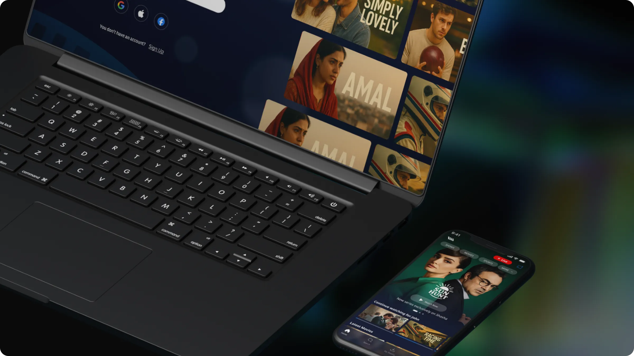
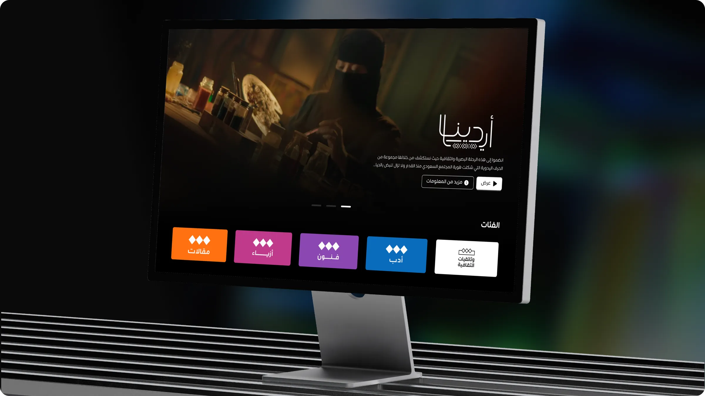
Consistency at scale
Hundreds of screens across products and platforms look and behave like one product, because they are built from one source.
Design systems
Bilingual, accessible component libraries and tokens that keep hundreds of screens consistent across web, mobile and TV.
What’s included
Outcomes
Hundreds of screens across products and platforms look and behave like one product, because they are built from one source.
Designers assemble instead of redrawing, engineers reuse instead of rebuilding, and reviews focus on the problem rather than the pixels.
Every component ships with its right-to-left behaviour defined, so Arabic is never a late-stage retrofit.
How it works
We audit what exists, find the duplicates and agree what the system must cover first.
Tokens, typography, colour, spacing, iconography and motion, documented for both scripts.
A library built in priority order, each component with its states, rules and accessibility notes.
Guidelines that answer the questions designers and developers actually ask.
Rollout plan, governance and training so the system keeps improving after we step back.
We design the structure before we touch a single pixel. A design system is that principle applied at scale: the tokens, components and rules that let a team ship a hundred screens that feel like one product.
Most design systems treat Arabic as a translation step. Ours define right-to-left behaviour at the component level, from mirrored navigation and directional icons to bidirectional text in tables and transaction lists, so Arabic and English screens are equally considered and equally tested.
A system only works if people use it. We write documentation around the questions designers and developers actually ask, show the right and wrong way to use each component, and leave your team with a governance model that keeps the system improving long after handover.
Related work
Industries
FAQ
When more than one team or platform ships the same product, when screens are drifting apart, or when every new feature starts from a blank canvas. If you recognise two of the three, the system pays for itself within a few releases.
We design and document the system in Figma and work with your engineers so tokens and components map one-to-one to code. Where a client has no front-end library yet, we can recommend and align with one.
Yes. Many engagements start with an audit of an existing library: removing duplicates, closing gaps, adding missing states and Arabic behaviour, and rewriting documentation so people use it.
Every component carries its mirroring rules, bidirectional text behaviour and type scale for both scripts. Icons that imply direction are defined in pairs. Numerals, dates and currency have explicit rules, so bilingual screens behave predictably.
With a light governance model: who owns it, how changes are proposed and reviewed, and a release rhythm. We can stay on as stewards for the first few cycles if your team prefers.
More services
Reach us
Tell us where your product stands today. We’ll come back within two working days with how we’d approach it.