WDS isn’t just an event website: it’s a strategic platform.
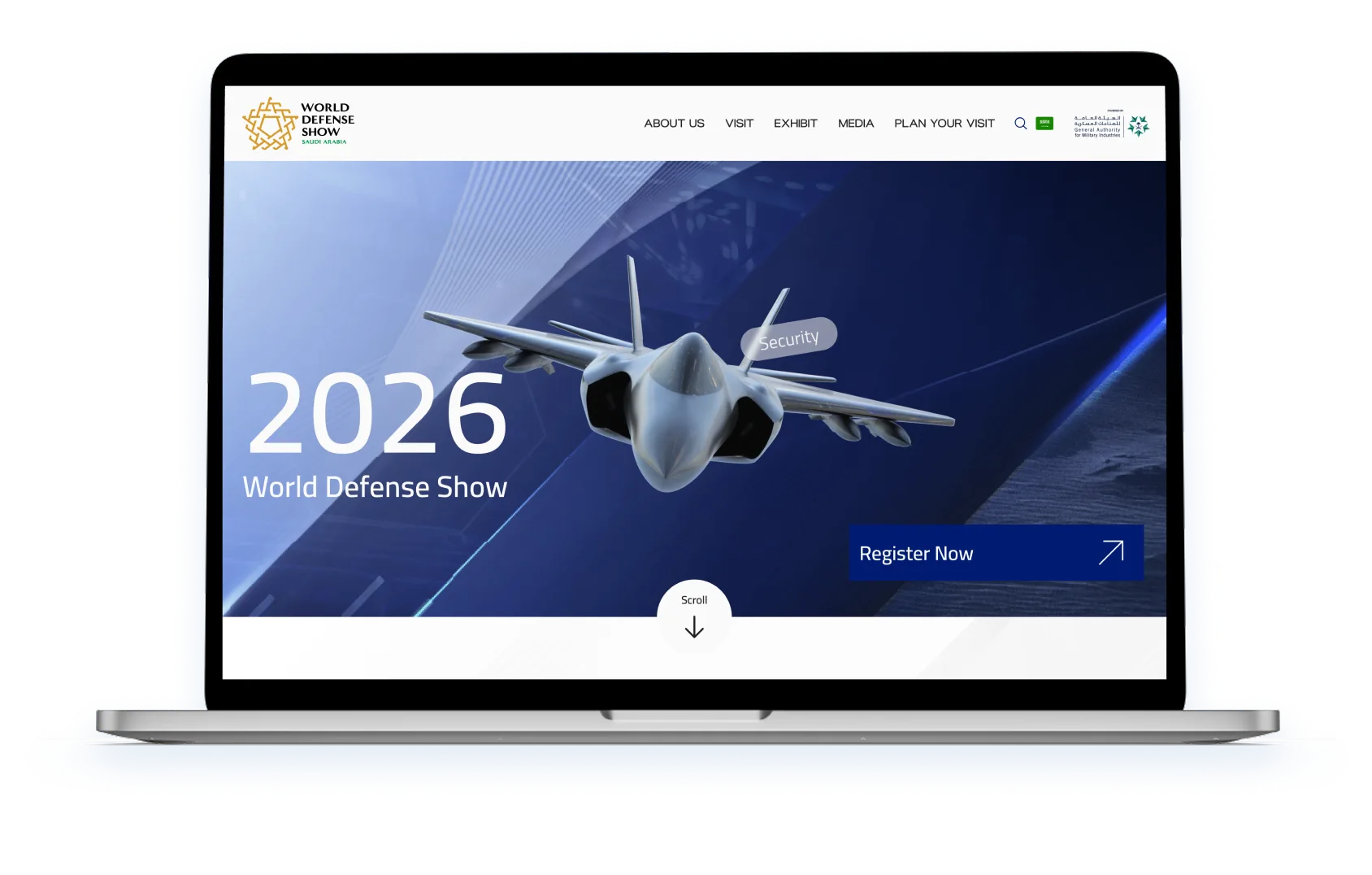
A persona-driven website for the World Defense Show in Saudi Arabia, one platform serving visitors, exhibitors and sponsors before, during and after the exhibition, built on a design system calibrated for institutional authority.
Discover
Understanding the problem space and aligning early direction
The World Defense Show presents a UX challenge rare in scale and complexity. Three completely different user types, Visitors, Exhibitors and Sponsors, share the same digital platform but have fundamentally different goals, timelines and information needs. A solution built for one group would fail the other two.
The discovery phase mapped these user journeys across three exhibition stages, Pre-exhibition, During and Post-exhibition, to understand where the platform needed to serve each group, and where the experiences diverge.
Three journeys, one platform
Visitors browse and plan. Exhibitors register and showcase. Sponsors negotiate and activate. Each group enters at a different point and needs completely different content surfaced first.
Phase shapes content
What a Visitor needs Pre-exhibition is entirely different from what they need During or Post. Static page hierarchies fail this model, the platform must adapt to when, not just who.
Authority is the primary UI signal
The WDS audience includes defence ministers and C-level executives. The visual language must signal institutional authority, not the playfulness of a consumer event platform.
Discovery highlights
- 3
- Distinct user groups mapped
- 3
- Exhibition stages defined
- 20+
- Website screens designed
Empathise
Understanding three mindsets attending the same event
Three user personas, Visitor, Exhibitor and Sponsor, were developed through research and stakeholder alignment. Each persona carries a distinct mindset, set of motivations, behaviours across the three exhibition stages, and specific needs the platform must address.
The journey mapping phase revealed that the platform needed to serve radically different goals simultaneously, from a defence official planning bilateral meetings weeks in advance, to a sponsor tracking ROI metrics after the event closes.
Mindsets
A closer look at key user groups to understand why users behave as they do.
Visitor
Exhibitor
Sponsor
Government
Define
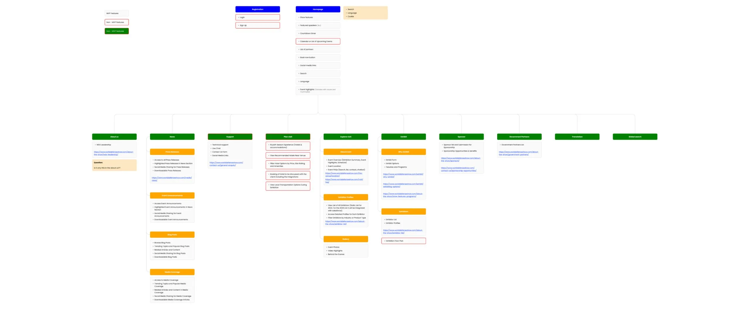
Turning insights into an information architecture
From the persona research emerged a clear structural challenge: the platform needed a single navigation system that could surface radically different content to three different user types. The information architecture had to be flexible enough to serve all three journeys without creating a confusing, cluttered hierarchy.
The IA defined the core user flows, Registration, Homepage, Programme, Page Info, Agenda Control, Exhibit, Sponsor and Ground Transportation, and mapped the decision points unique to each persona across each journey stage.
8 core user flows identified
Registration, Homepage, Programme, Page Info, Agenda Control, Exhibit, Sponsor and Ground Transportation, each mapped against all three persona types and all three exhibition stages.
Persona-conditional content
The same page serves different content depending on who is viewing it. An Exhibitor viewing the Homepage sees registration CTAs; a Visitor sees the programme. One URL, three experiences.
Time shapes content
What the platform surfaces changes based on exhibition phase, Pre, During and Post. The IA accounts for this temporal dimension, not just the user-type dimension.
Ideate
Designing for user thinking, not content categories
The journey maps translated persona insights into specific desired behaviours at each stage of the exhibition. Rather than designing pages around what the organisation wanted to publish, every screen was designed around what each persona was trying to accomplish at that specific moment.
This behavioural approach, mapping Awareness, Preparation, Engagement, Networking, Action, Feedback and Continued Participation, gave the design team a clear brief for every screen: what is this user trying to do right now, and what does the platform need to show them to help?
Design system
A visual language built for institutional authority
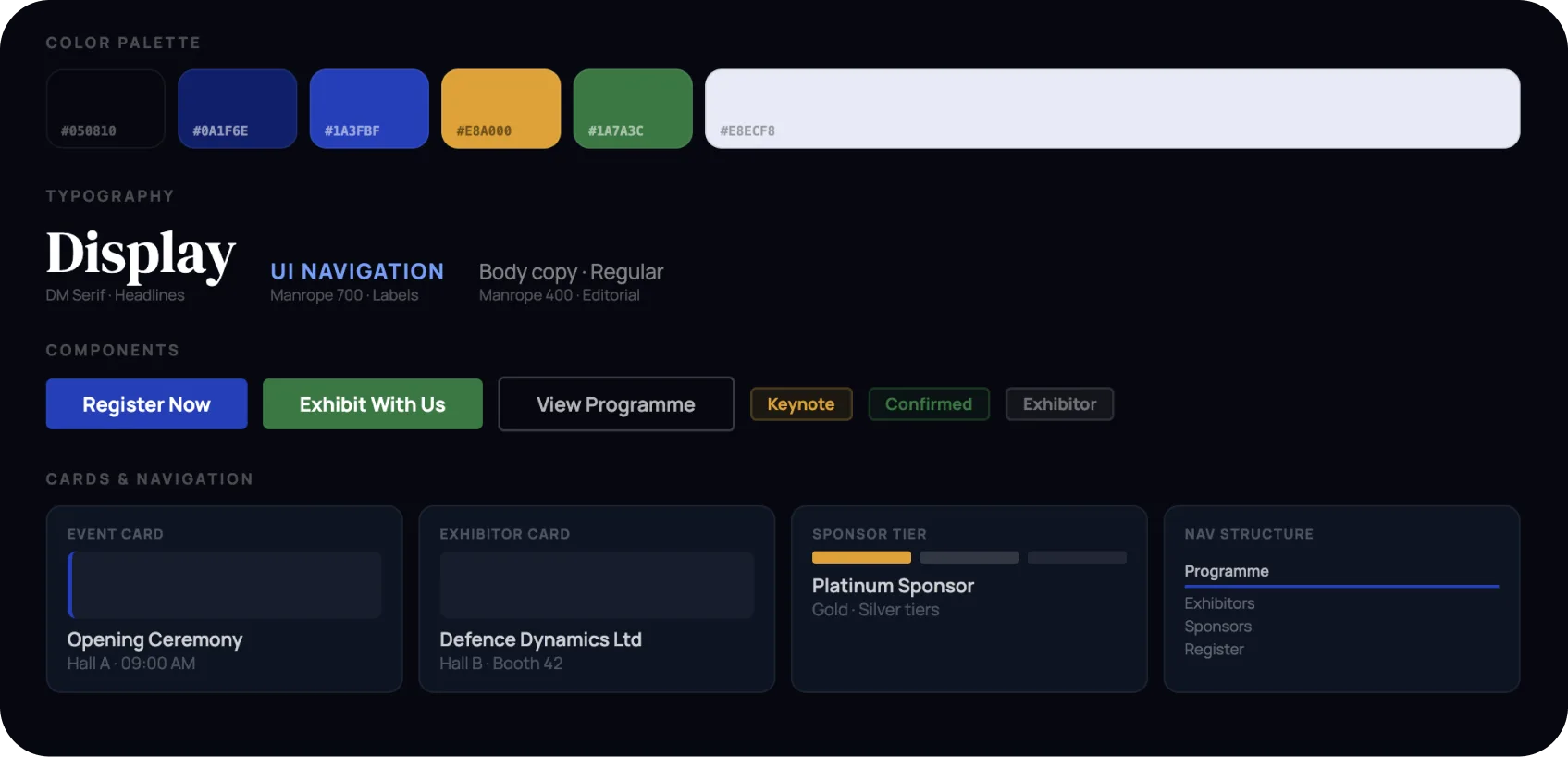
The WDS design system needed to communicate at the level of its audience, defence ministers, procurement officials and C-suite executives. Deep navy anchors every surface. Royal blue drives interaction. Gold signals priority. Green confirms action. Together they build a system that is precise, authoritative and unmistakably military-grade.
Navy signals authority
Deep #050810, the colour of military dress uniforms and defence letterheads. Every surface communicates credibility before a single word is read.
Gold for priority, green for action
Gold highlights keynote speakers, platinum sponsors and critical CTAs. Green confirms registration and positive states, two colours, two distinct jobs, no overlap.
Grid handles complexity
The site carries programme schedules, exhibitor directories and sponsor packages simultaneously. A strict grid system keeps the information dense but never cluttered.
Prototype
Designing the digital platform from the ground up
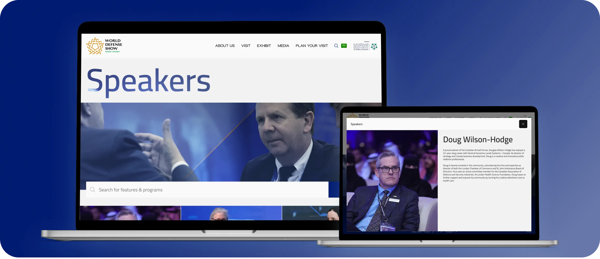
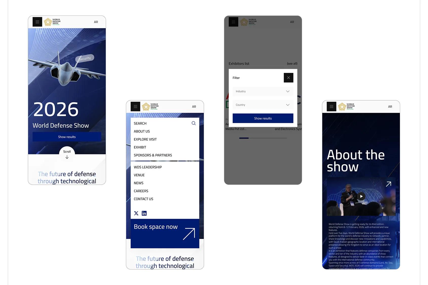
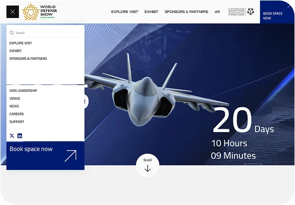
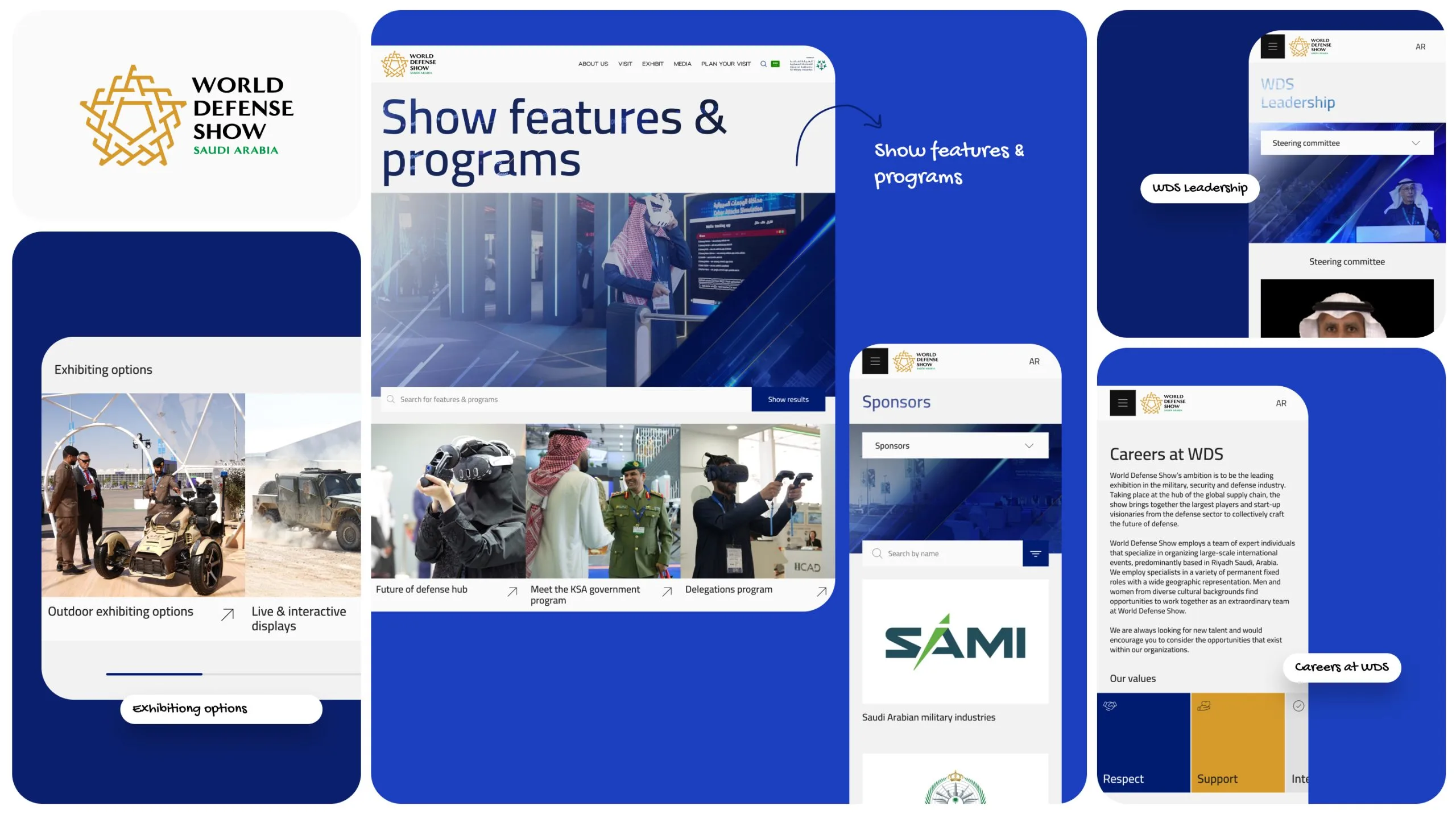
The website needed to function simultaneously as a marketing platform, an operational tool for registered users, and a post-event archive. Each section was designed with a specific persona and journey stage in mind, never as a generic page in a hierarchy, but as a purposeful moment in a user’s specific goal. Dark navy surfaces with white editorial content, gold highlight accents and sharp typographic hierarchy give every page a premium, authoritative feel consistent with the scale and seriousness of the event.
Delivery
One platform serving three user types across three phases
The World Defense Show digital platform launched as a fully designed website, a single system serving Visitors, Exhibitors and Sponsors across the Pre-exhibition, During and Post-exhibition phases. Grounded in research, shaped by journey mapping, and built on a design system calibrated for institutional authority.
What we delivered
- 3
- User personas mapped
- 3
- Exhibition phases designed
- 20+
- Website screens delivered
- 01
- Unified design system
The approach
The World Defense Show is not a consumer product, it is a strategic instrument for the global defence industry. Designing it required understanding the professional context, motivations and information needs of three very different user types, then building a single digital platform that serves all three without compromise.
01
Mapped three journeys simultaneously
02
Designed for temporal complexity
03
Built a system that signals authority
What we learned
One platform, three front doors
A homepage serving everyone equally serves no one. WDS was designed with three clear CTA tracks, Visit, Exhibit, Sponsor, so every user self-selects their path immediately.
Time is a design dimension
What a Visitor needs before the event is completely different from what they need on the show floor. The exhibition phase is as important as the persona.
Authority is a UX requirement
When users are defence ministers and procurement officials, visual language must earn trust before content is read. Design quality is itself a trust signal for this audience.